An editorial study of Avenir
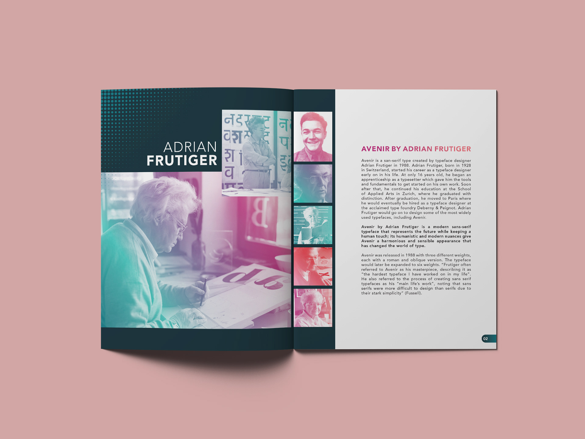
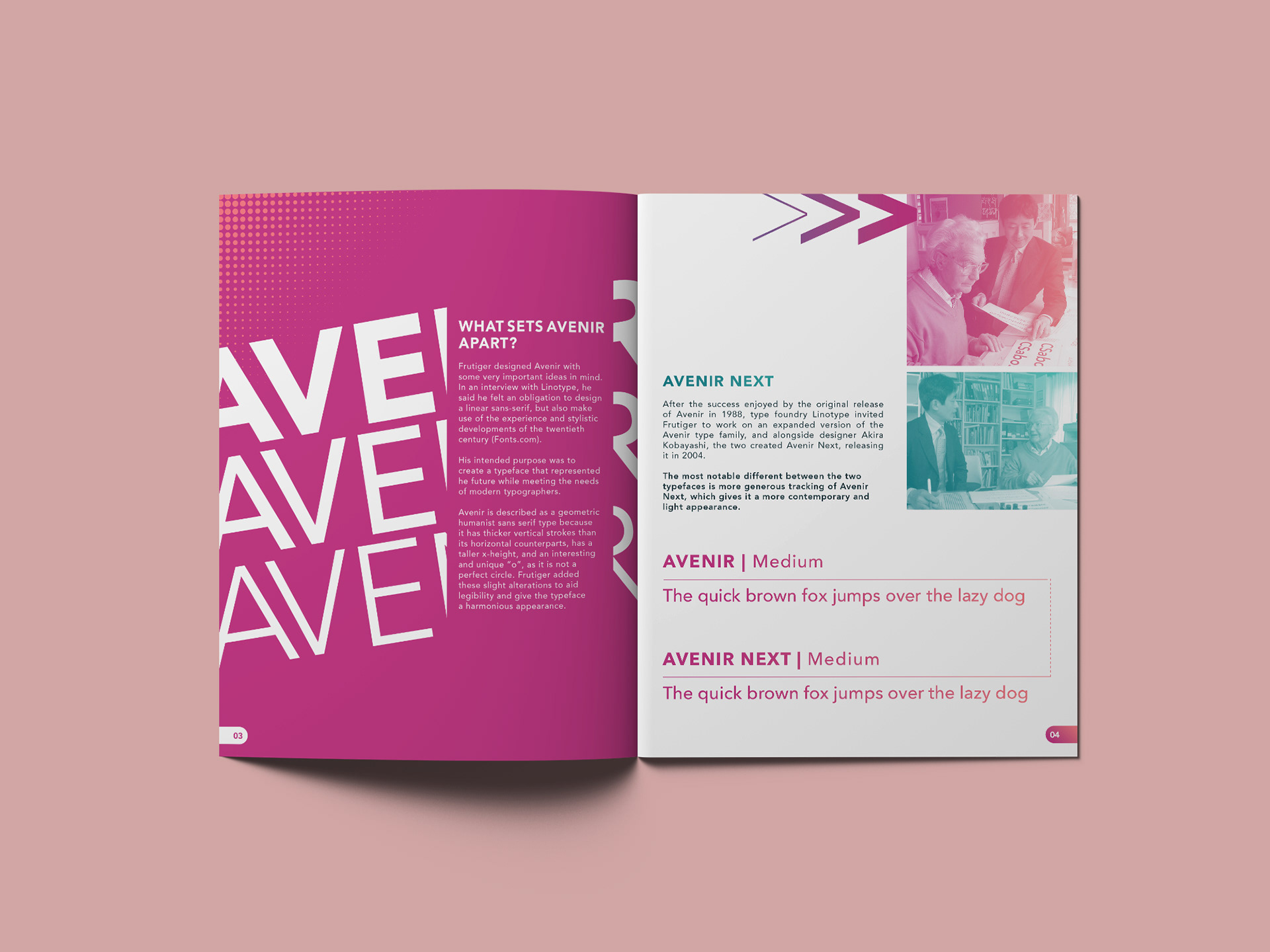
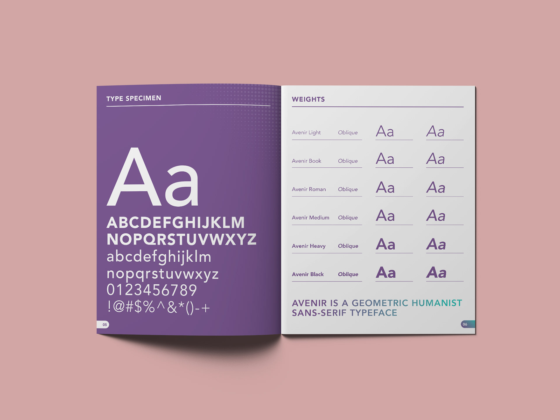
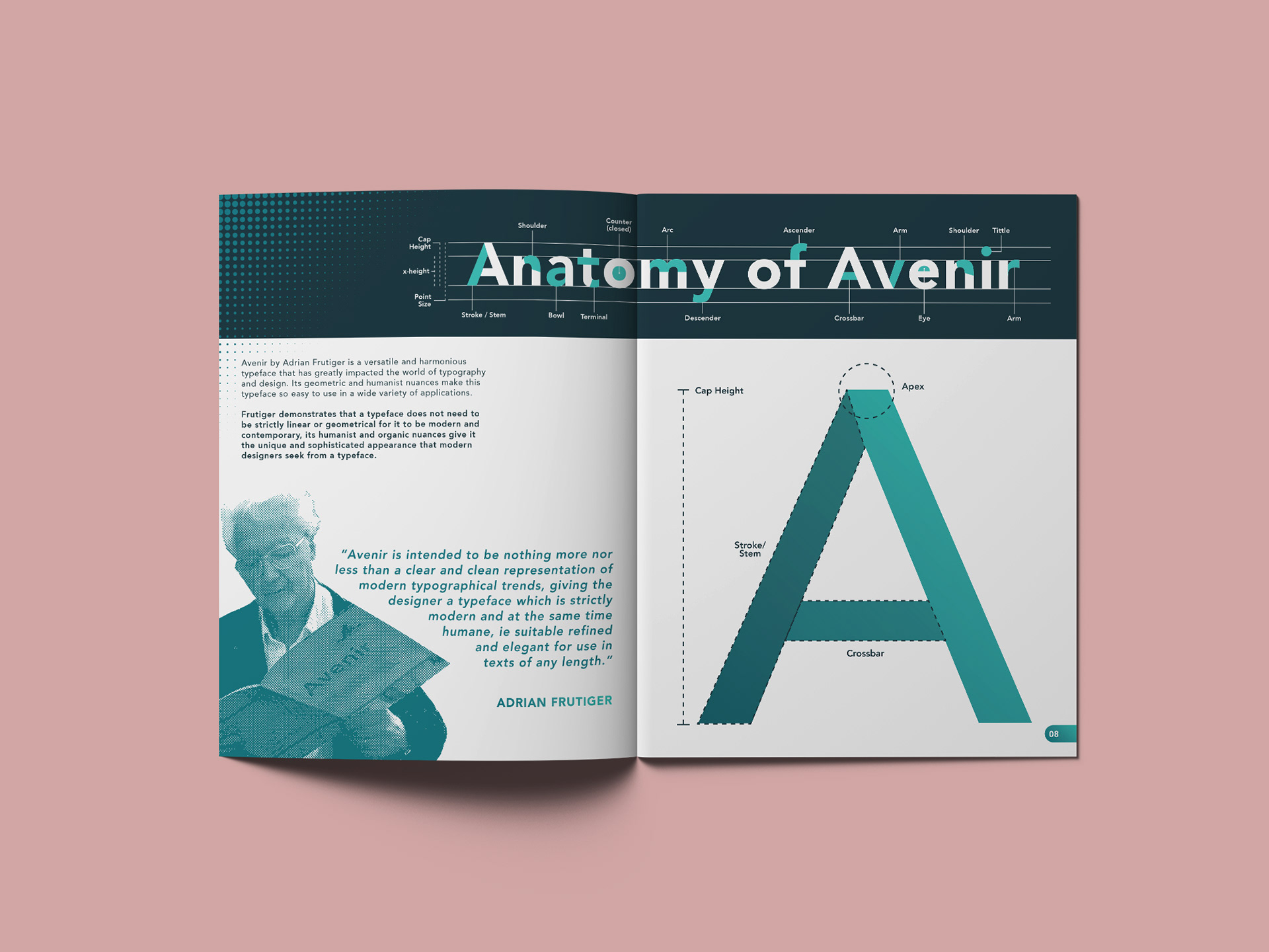
Avenir is an editorial typography study centered on the humanist sans-serif typeface designed by Adrian Frutiger. The publication explores Avenir’s history, structure, and versatility through a carefully paced editorial narrative that balances information with visual clarity
The project focuses on creating a cohesive reading experience using strong typographic hierarchy, grid-based layouts, and expressive color systems. Each spread is designed to guide the reader through the typeface’s origins, distinguishing characteristics, and real-world applications while maintaining consistency and flow across the publication
The final piece emphasizes Avenir’s role as a modern, human-centered typeface and demonstrates a deep understanding of editorial design principles and typographic storytelling