The Pace We Speak
A gentle, advocacy-driven visual identity designed to slow conversation and create space for stuttering and diverse speech patterns
Context & Intention
Modern communication is often shaped by speed, efficiency, and fluency. Conversations are expected to move quickly, leaving little room for pauses, repetition, or difference. For children, teens, and adults who stutter, this pressure can lead to being interrupted, rushed, or misunderstood, turning speech into something performative rather than natural
The Pace We Speak is a self-initiated concept awareness campaign created in response to these expectations and a desire to shift how stuttering is perceived and discussed. Rather than positioning fluency as the goal, the project centers patience, empowerment, care, and community while amplifying real voices and lived experiences
Guided by respect and intentionality, the visual identity treats communication not as something to perfect but as a human act that unfolds at its own pace. Through thoughtful shape, typography, and illustration, the system invites viewers to slow down and listen more attentively
Designed for children, teens, and adults who stutter, as well as parents, educators, speech-language pathologists, and supporters, the project seeks to normalize stuttering as a natural human variation and foster connection grounded in dignity and understanding
Name Development
The Pace We Speak was developed through a language-led exploration centered on communication, rhythm, and care. While multiple naming directions were considered, the final name felt both grounded and human
Pace acknowledges that communication unfolds differently for everyone, emphasizing timing and permission to move slowly. We Speak reinforces collectivity and shared understanding, shifting the focus from individual performance to connection
Creative Direction
Moodboard
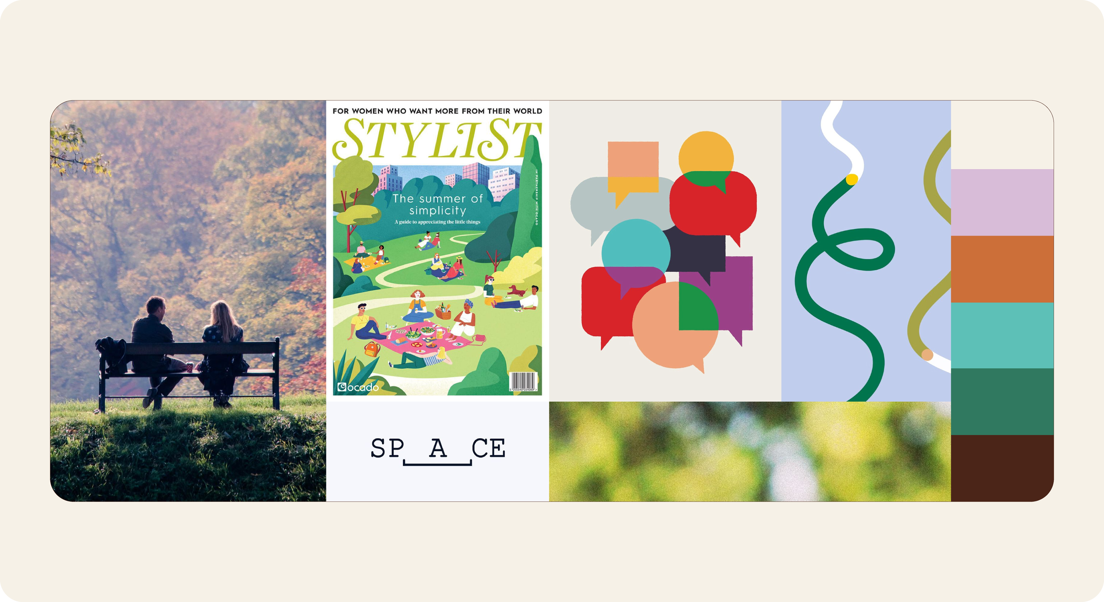
To establish the visual direction for The Pace We Speak, I gathered references rooted in care, rhythm, humanity, and communication. The inspiration explored patience, presence, and shared space through quiet moments, flowing forms, and grounded color, favoring warmth and clarity over urgency or polish. The moodboard helped define the project’s tone, visual language, and emotional range, grounding the identity in listening and respect before evolving into a cohesive visual system
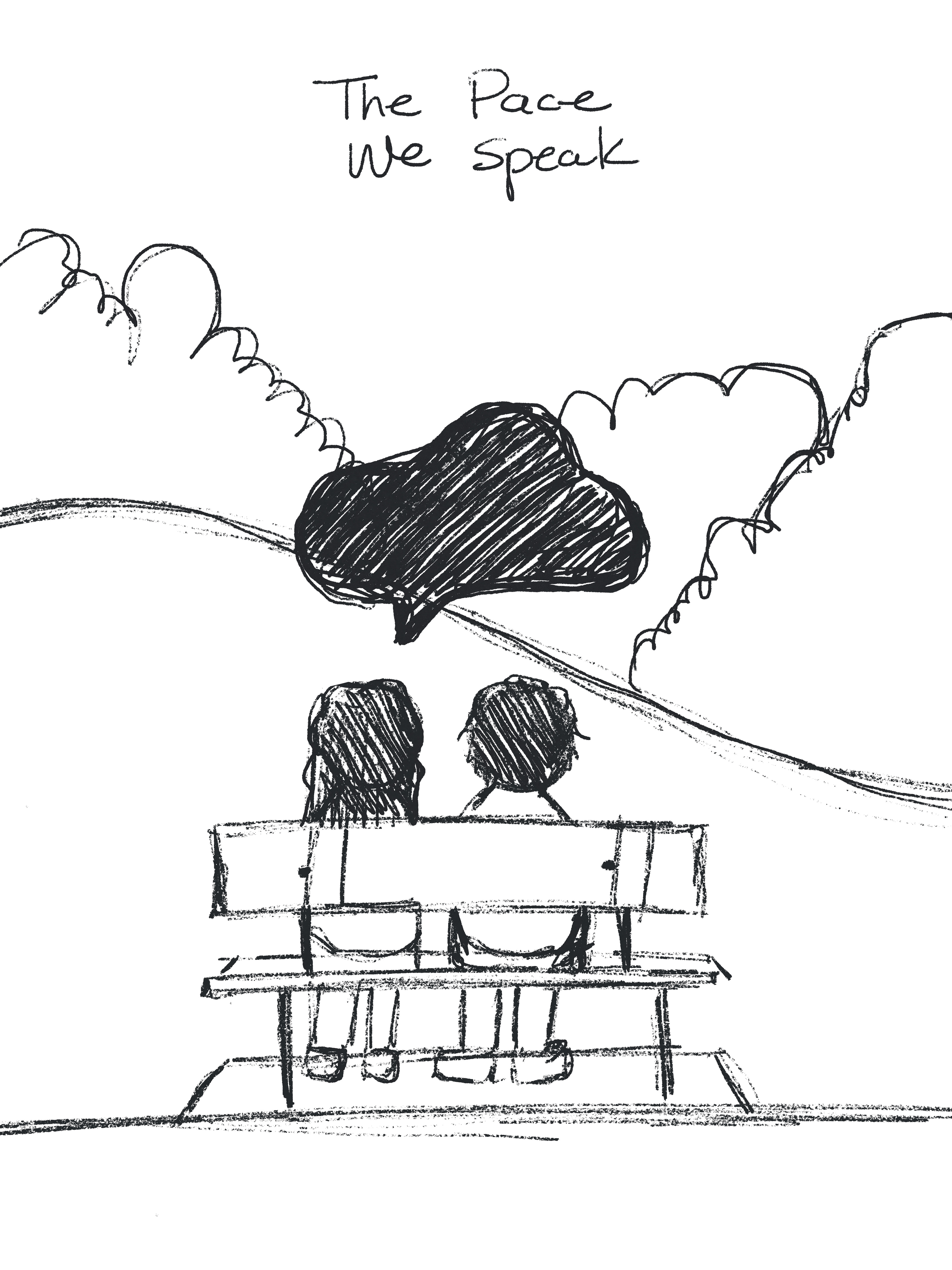
Gesture Explorations
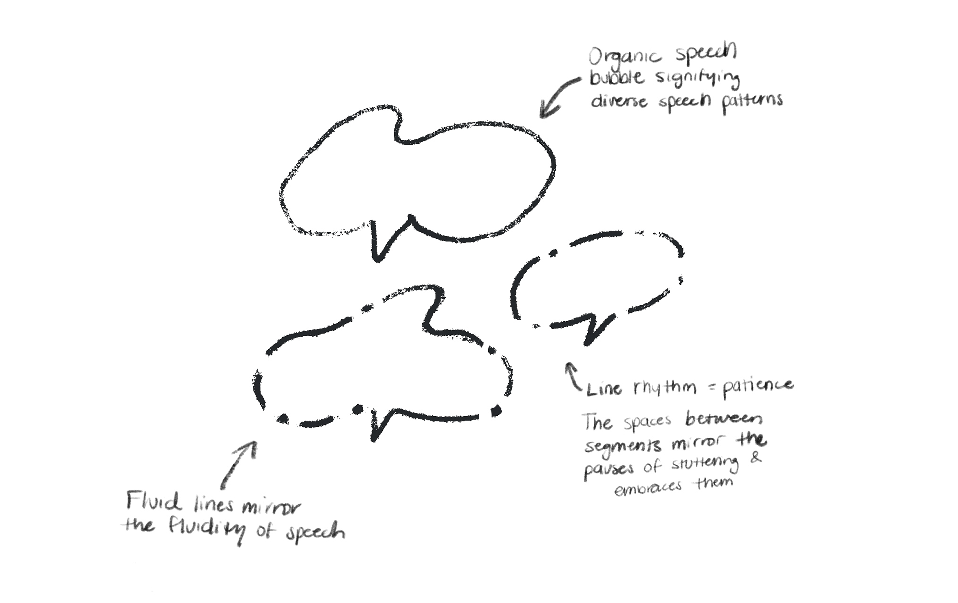
Early gesture explorations focus on rhythm, pause, and flow rather than precision. These sketches explore how form can reflect different speech patterns, honoring hesitation, pauses, and silence as meaningful parts of communication
Visual Identity
Logo System
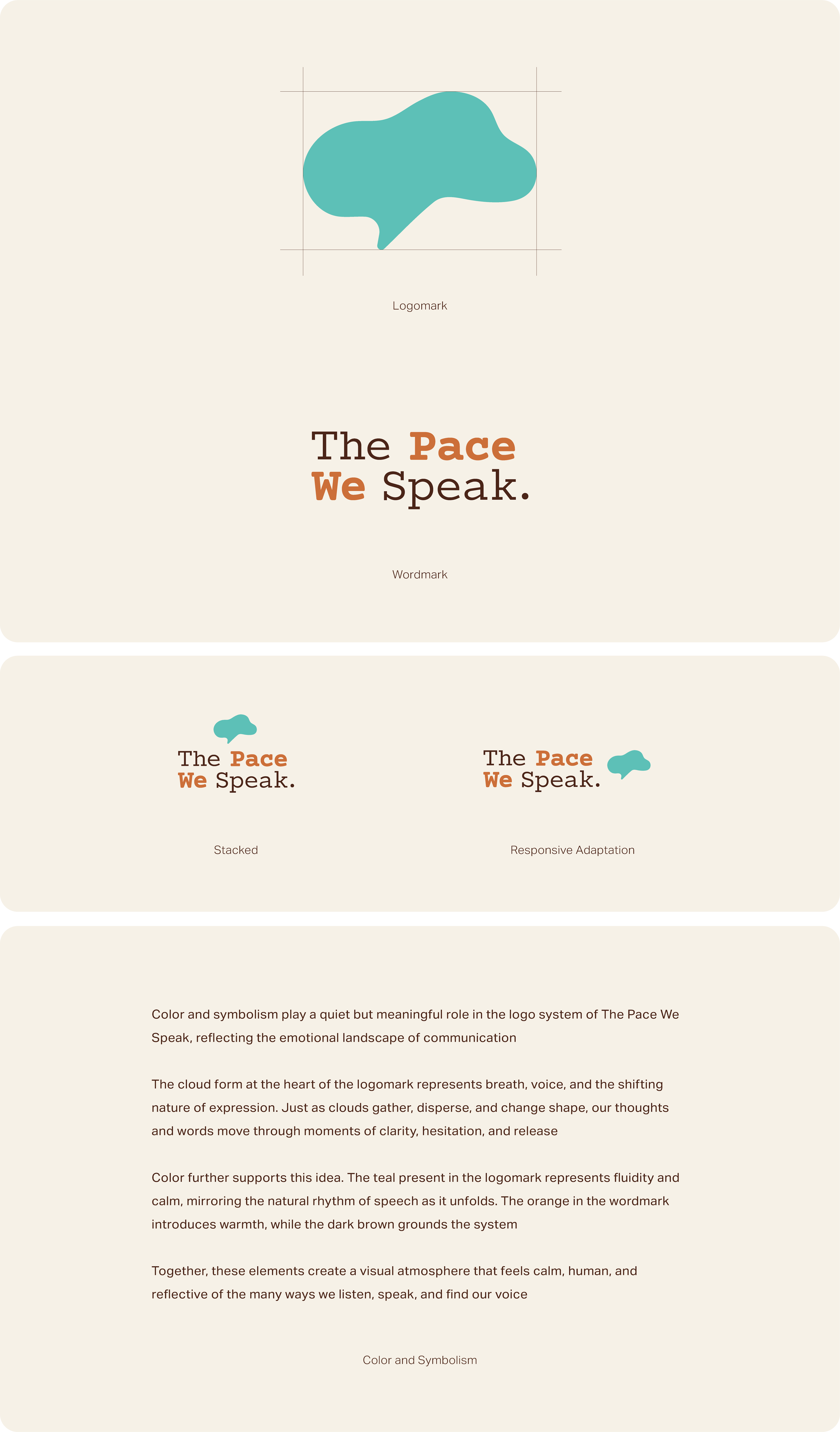
An organic speech silhouette anchors the identity, while the serif wordmark introduces clarity with care. The stacked and responsive adaptations allow flexibility, while the speech mark functions independently as a recurring motif across the identity
Color in Use
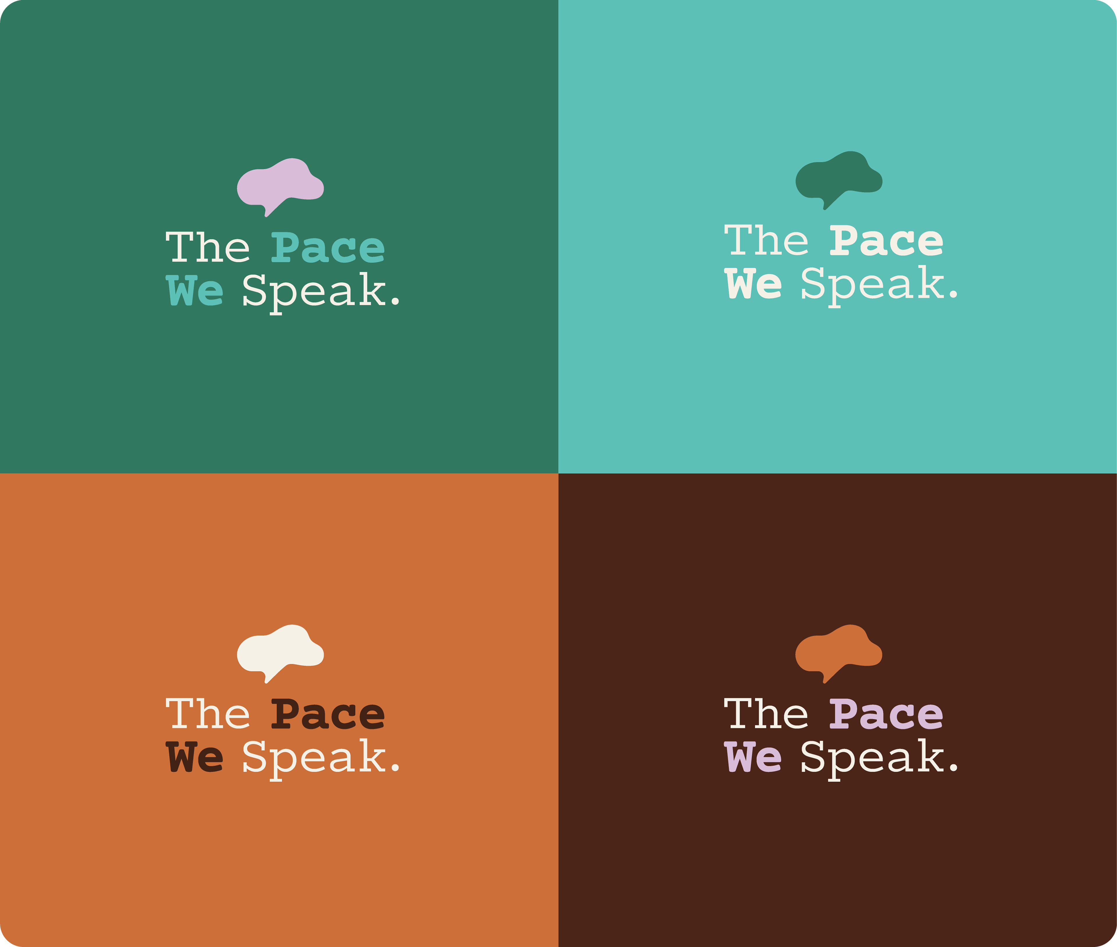
The color system balances warmth and calm to reflect the project’s core values of patience, care, and presence. Color combinations are intentionally contrasted for clarity without relying on urgency or high saturation, favoring harmony and softness to reinforce communication as human, supportive, and unhurried
Color Palette & Typography
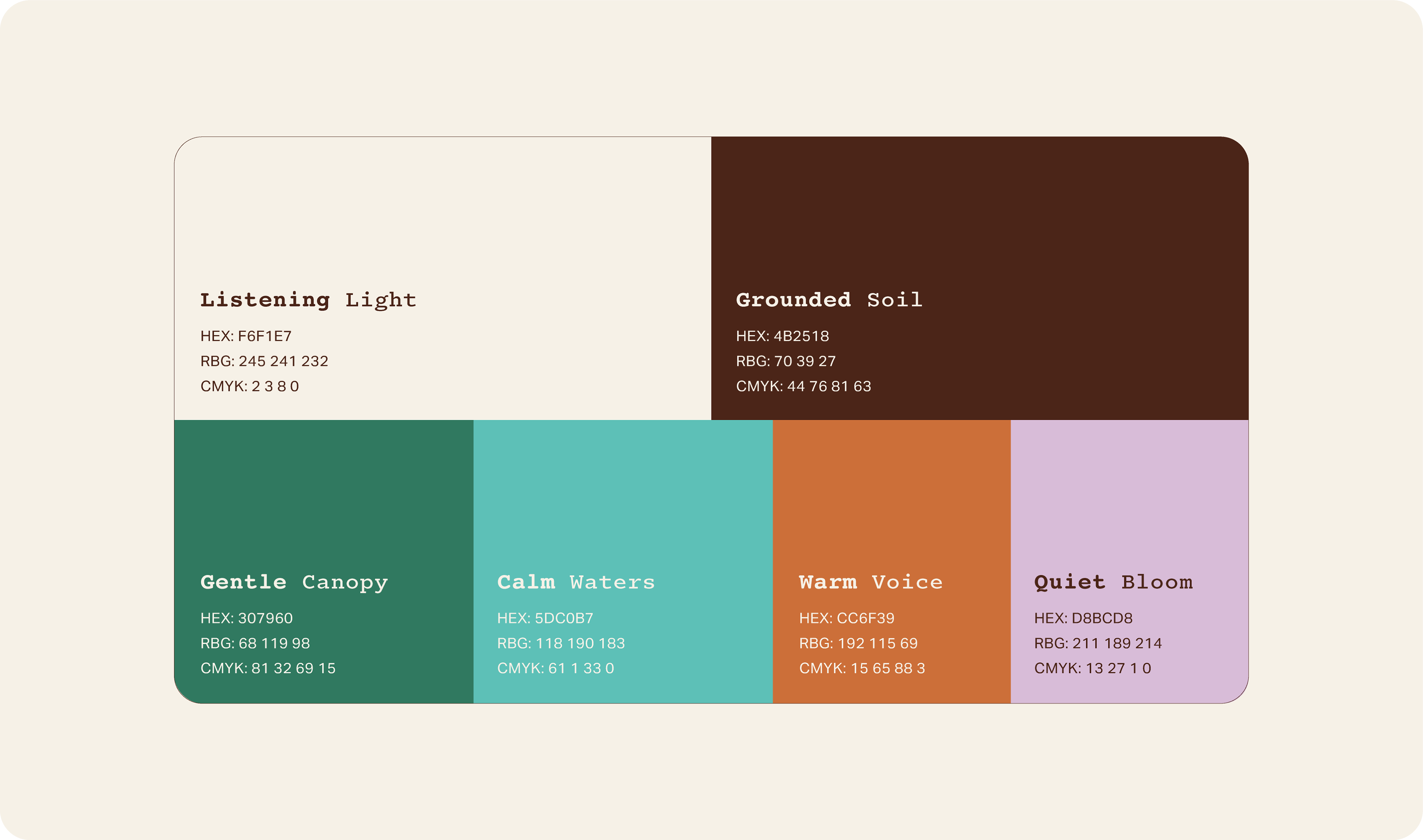
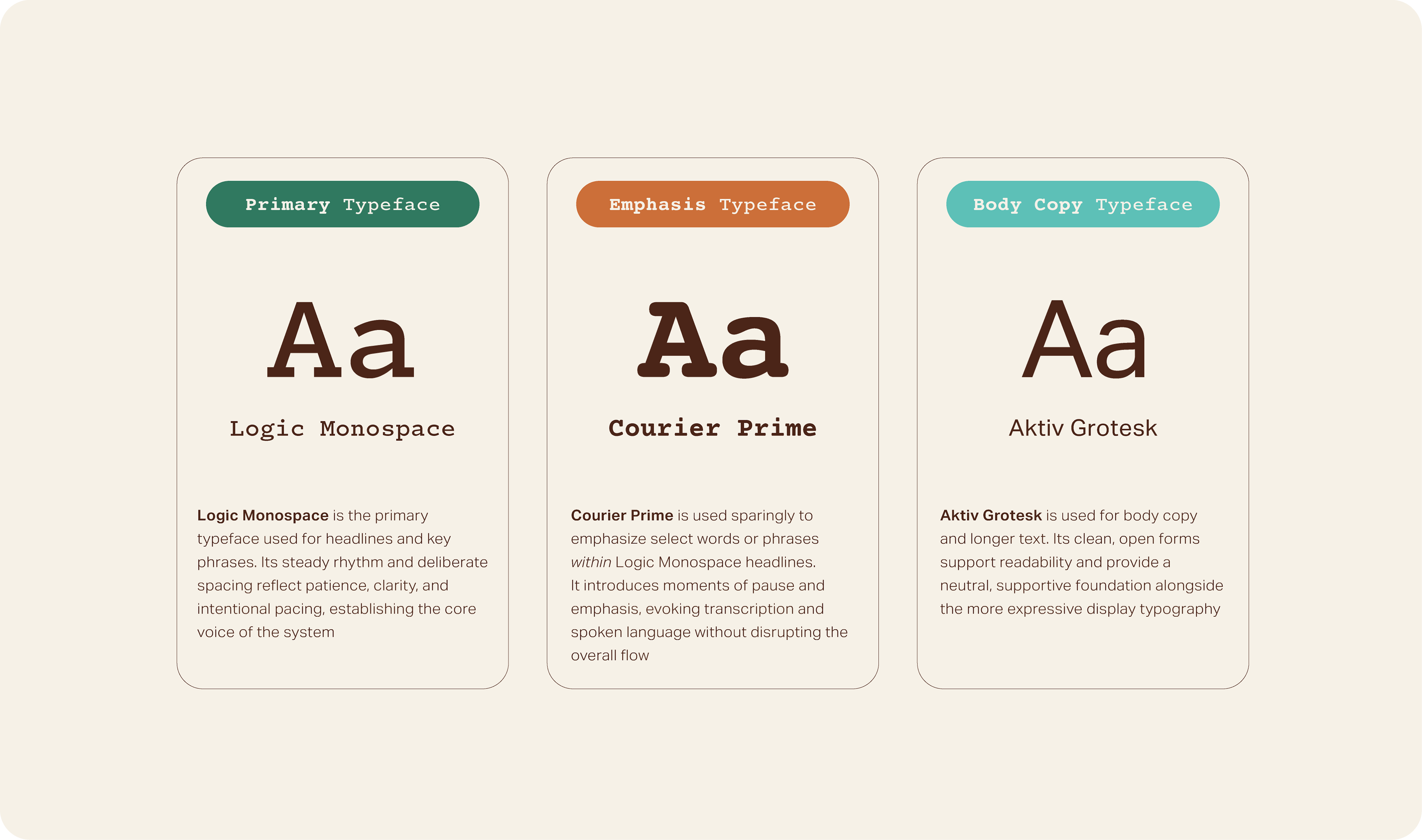
The color palette and typography work together to create a visual rhythm grounded in patience and clarity. The palette balances earthy depth with calm, muted tones to foster emotional steadiness while maintaining accessibility. This is paired with a structured typographic system that contrasts steady headline forms with a clean, highly readable body typeface. Together, color and type establish a cadence that feels deliberate and human
Imagery
Photography Direction
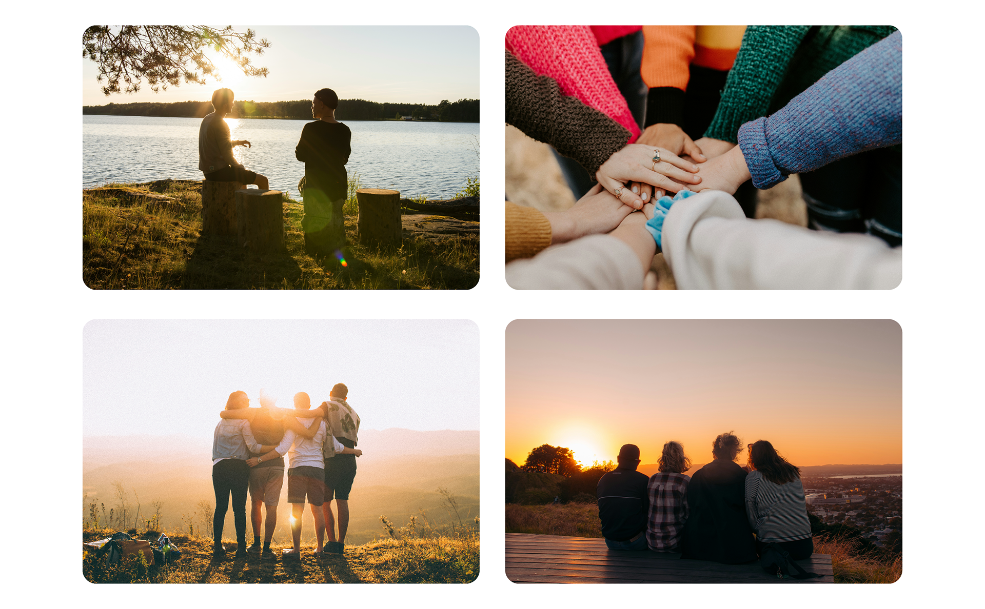
The photography direction centers on warmth, community, and shared space. Images were intentionally selected to reflect moments of connection, quiet conversation, and collective presence. Golden-hour lighting and soft natural environments reinforce a sense of calm and belonging, allowing the visuals to echo the project’s core message: every voice deserves space at its own pace
Photography direction developed using curated imagery from Unsplash. Photographs by Aaron Blanco Tejedor, Hannah Busing, Helena Lopes, and Nik Schmidt
Illustration Direction
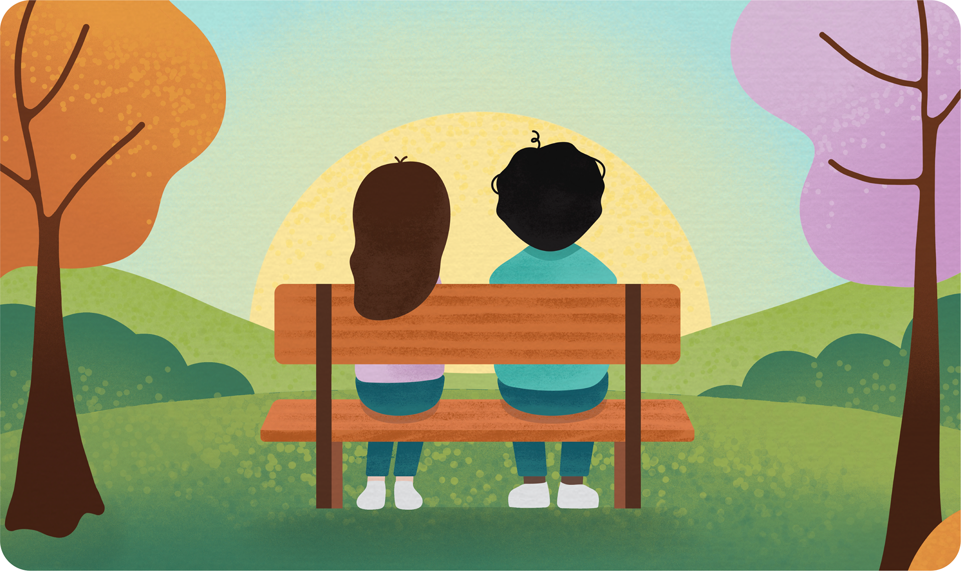
A quiet moment of shared presence
The illustrative direction establishes the emotional tone of The Pace We Speak and is intentionally guided toward a younger audience. Soft gradients, rounded forms, and open compositions create a gentle, approachable visual language that reflects the project’s core values of patience, warmth, and presence. The scene centers on two figures seated side by side at sunset, emphasizing stillness and companionship over urgency
Expressive Elements
Advocacy Marks and Voice-Driven Phrases
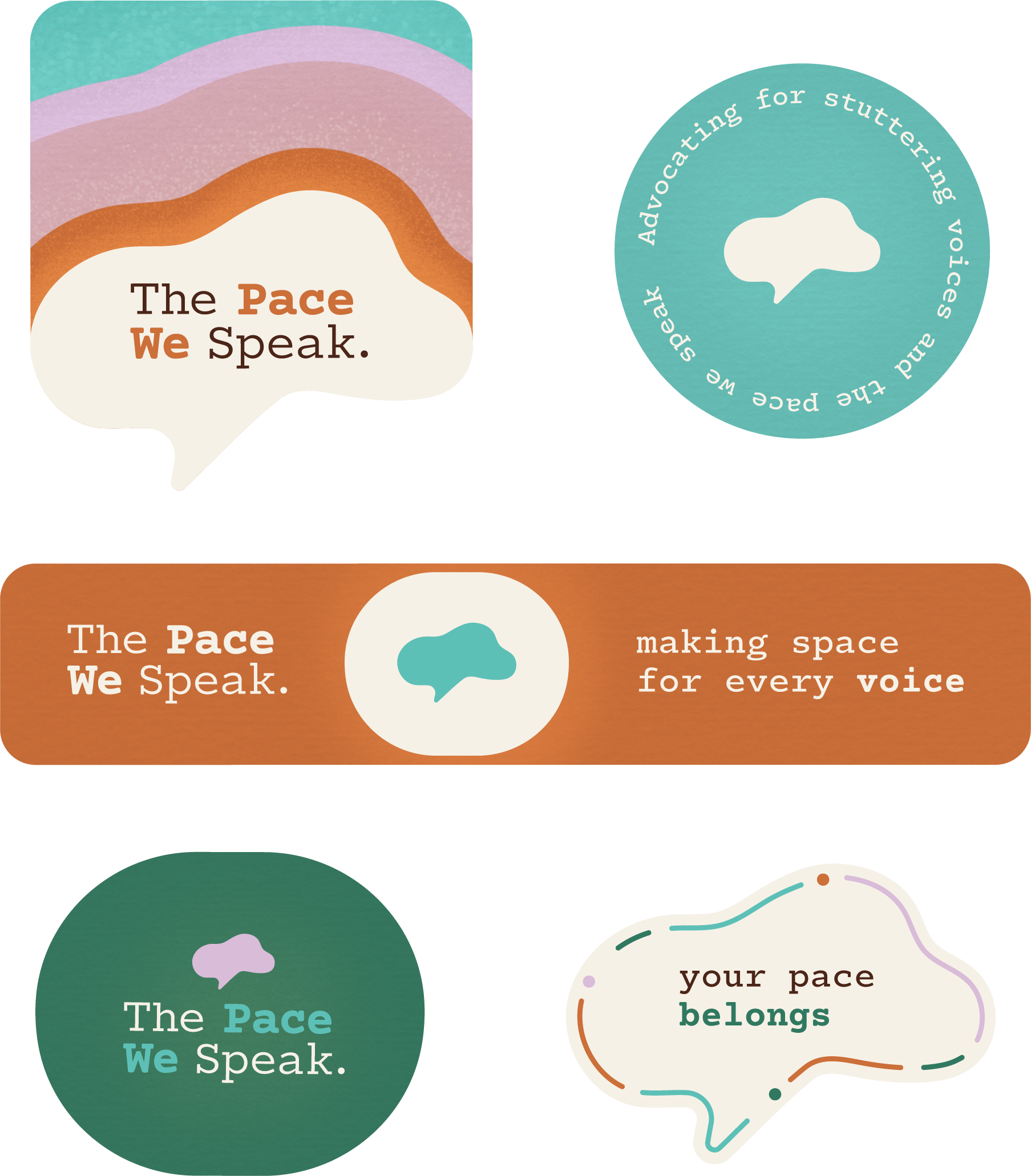
These signature marks express the project’s values through direct, affirming language. The phrasing shifts the focus from awareness to acceptance, creating space for people to feel seen without pressure to perform
Iconography
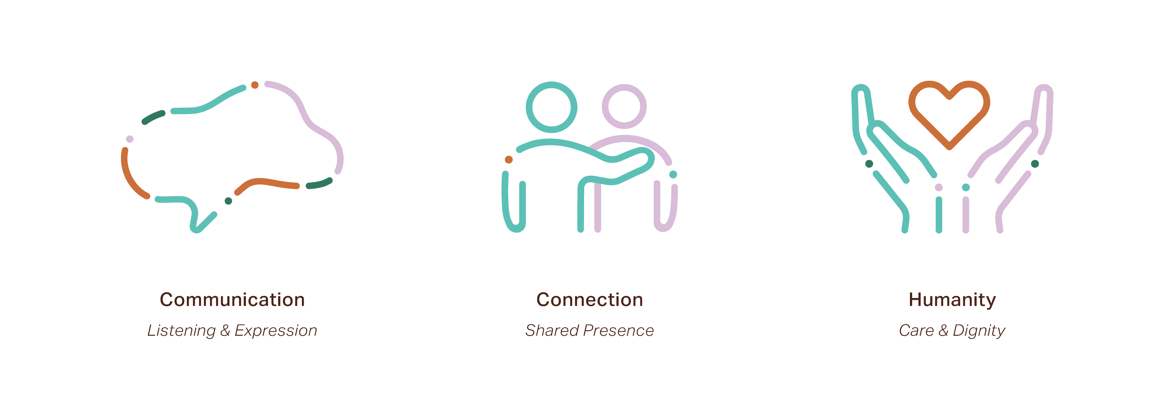
The iconography extends the project’s organic shape language into simplified forms. The primary speech silhouette acts as a recurring motif throughout the identity, while supporting icons reinforce themes of communication, connection, and shared humanity
Resonant Pattern
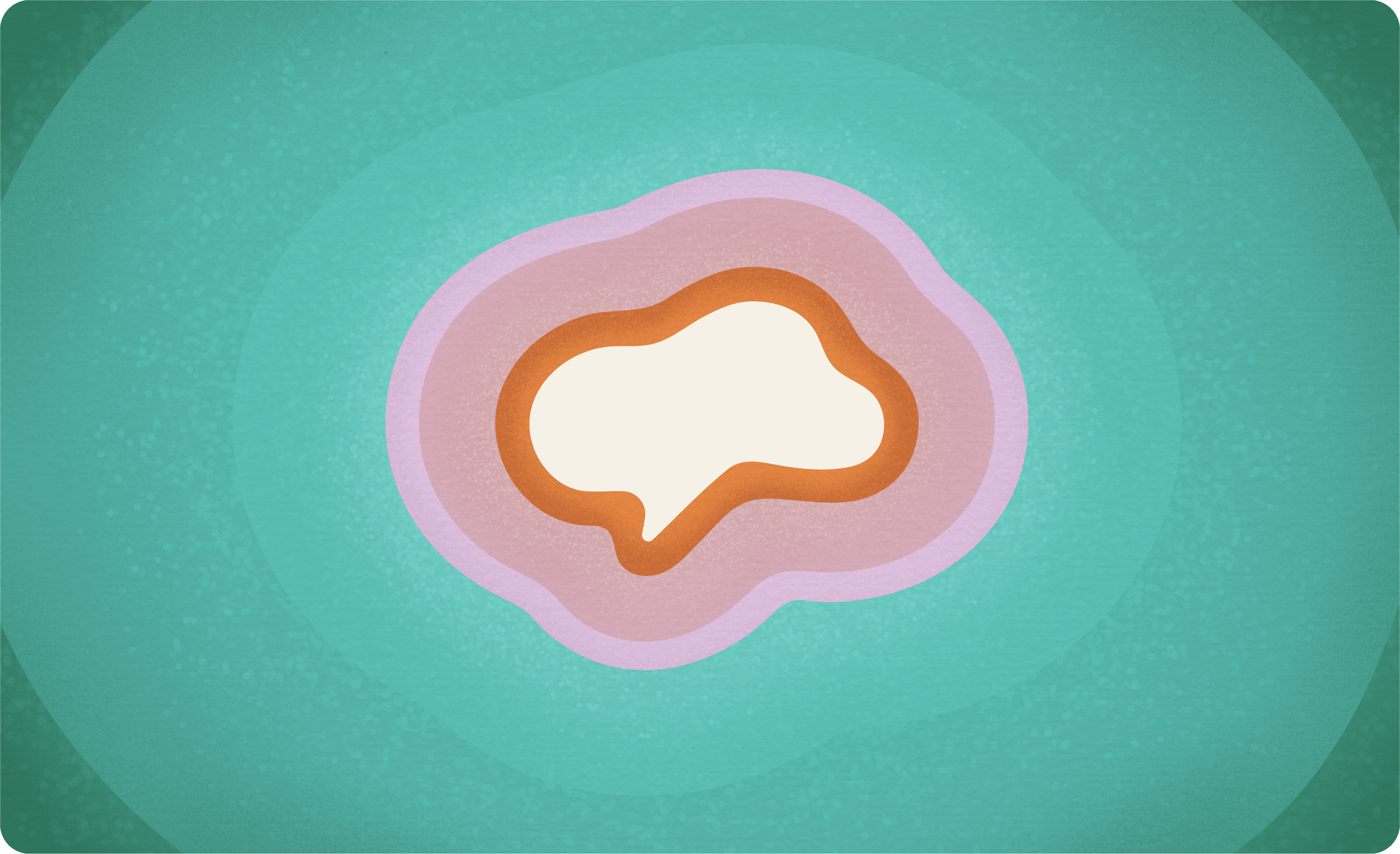
Organic ripple forms radiate from the primary speech silhouette, extending the identity into layered compositions that build atmosphere, immersion, and spatial depth
With the The Pace We Speak visual identity established, the focus shifts to how it comes to life through thoughtfully chosen real-world applications
Print and Ephemeral
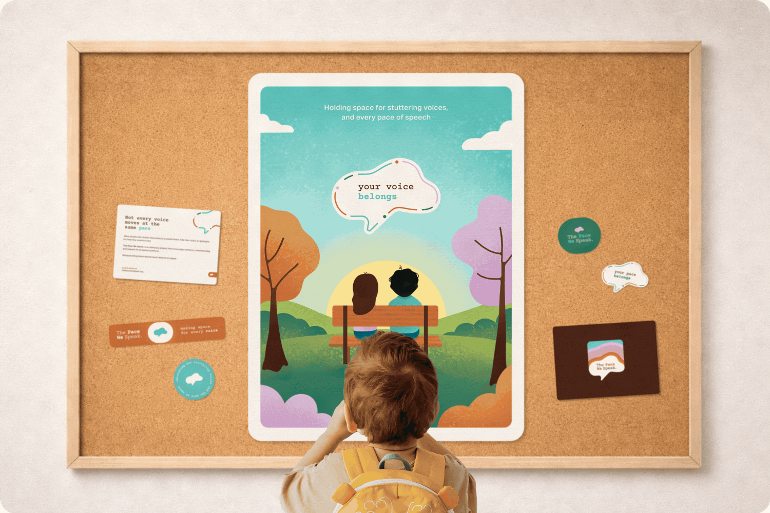
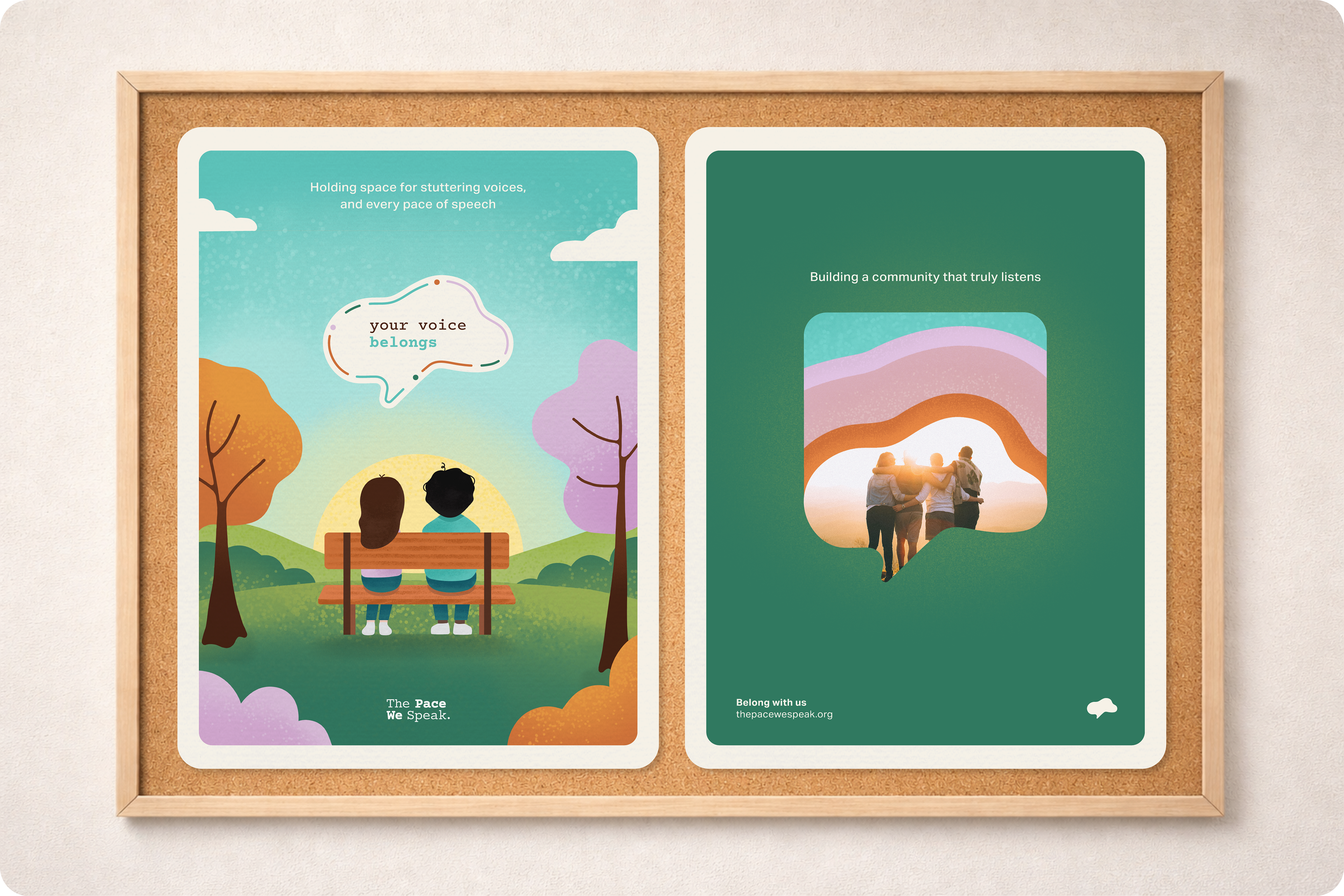
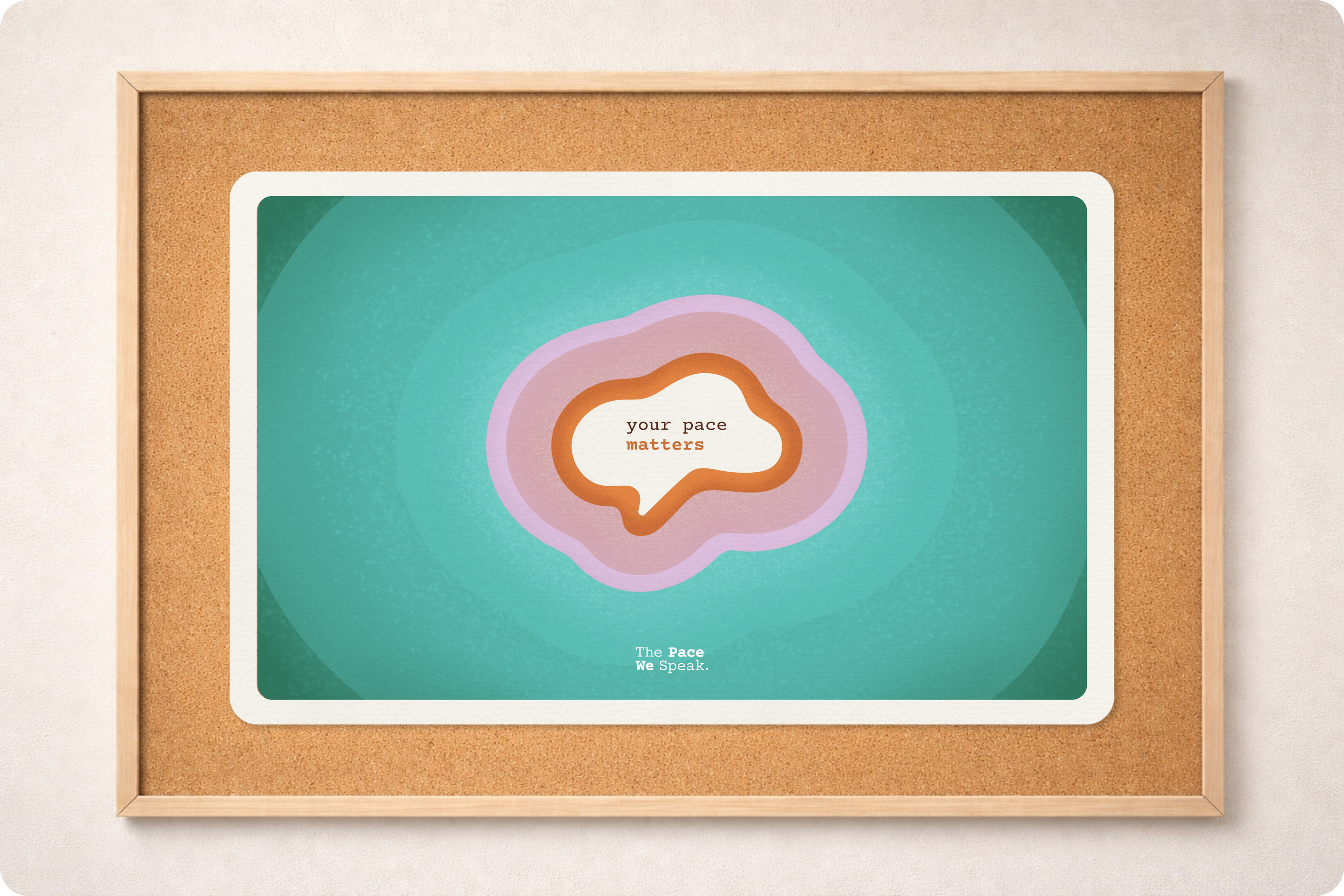
Poster Collection
This poster collection extends The Pace We Speak campaign into shared public spaces. Designed for hallways, counseling offices, community centers, and university campuses, the series invites viewers to pause and feel a sense of belonging
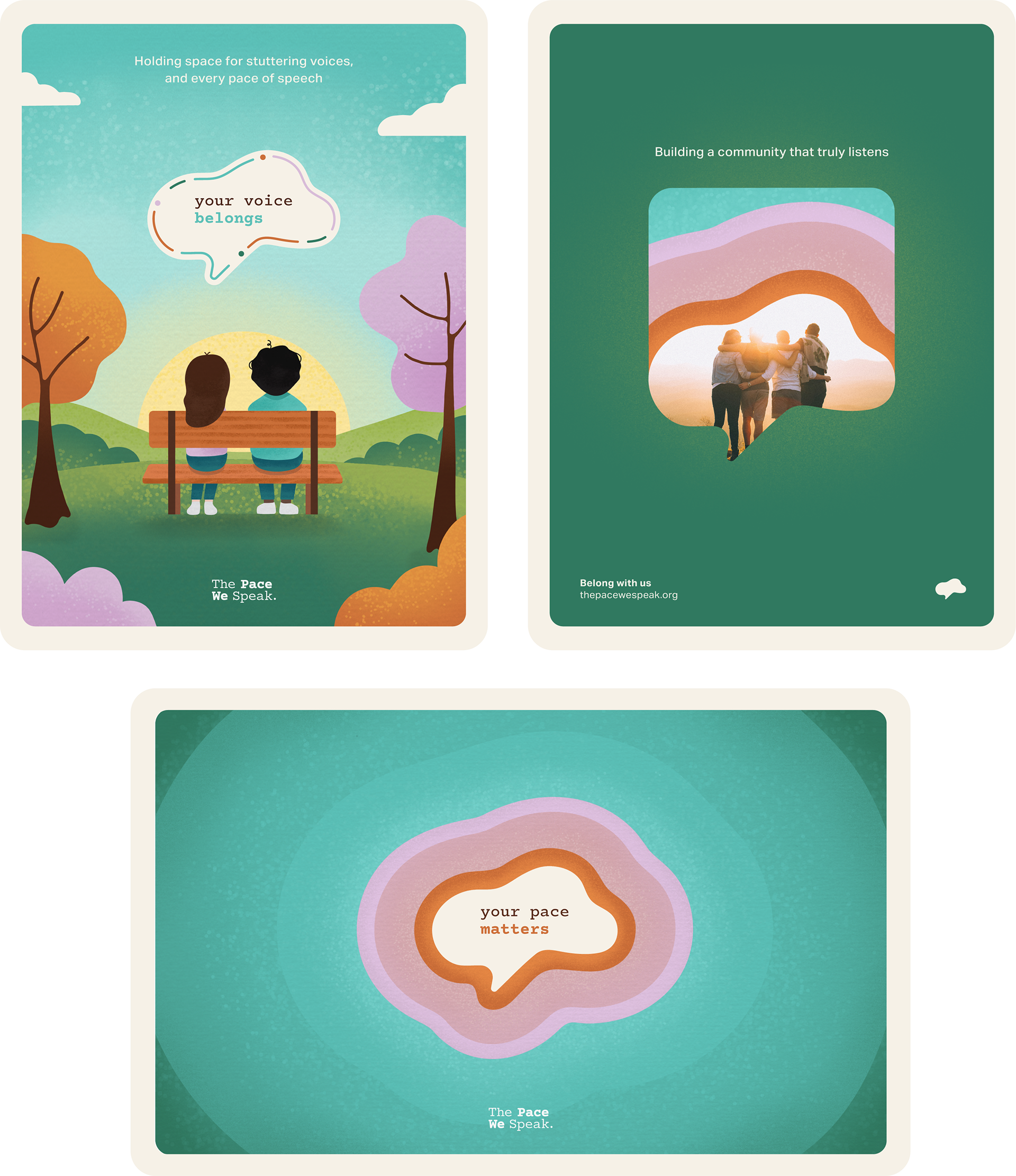
Each poster explores a different emotional entry point through narrative illustration, community imagery, and quiet affirmation, while maintaining a cohesive visual language rooted in softness, rhythm, and care
Postcard Design
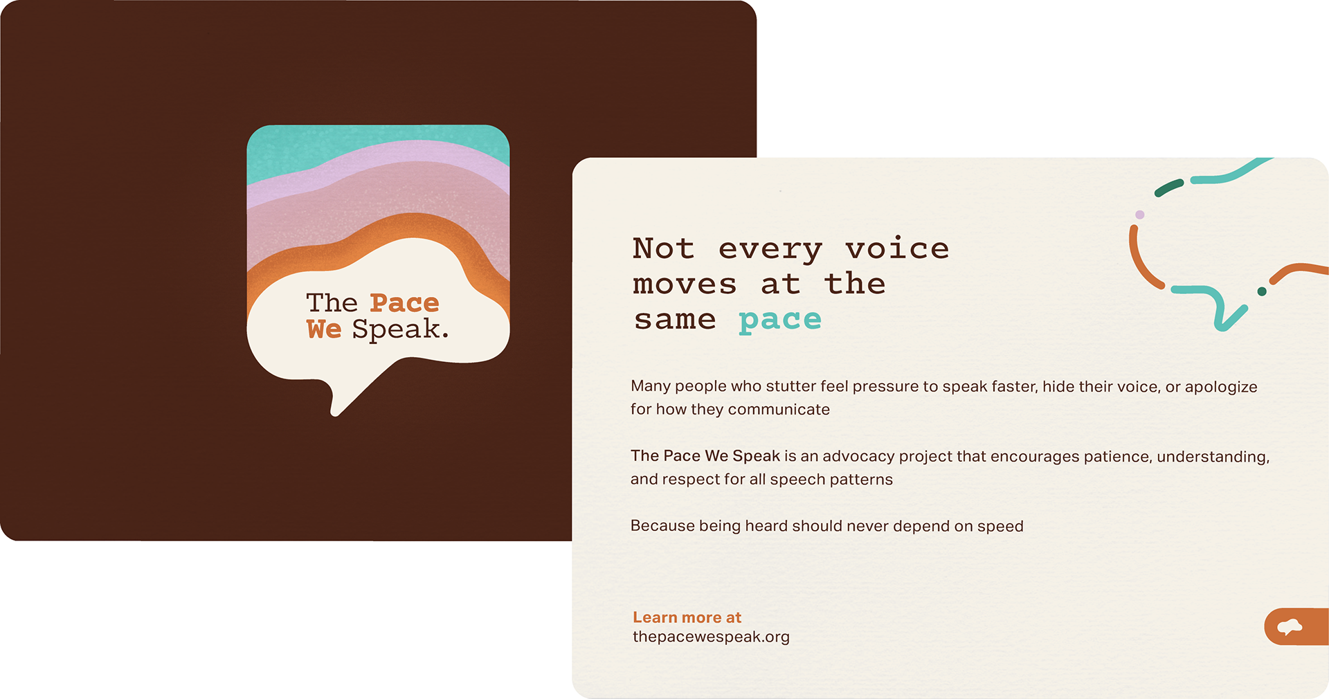
The postcard design translates the identity into a tangible, shareable format that balances visual warmth with clear advocacy messaging. Color, iconography, and texture work together to maintain emotional softness without compromising legibility
Social Media Presence
Digital Advocacy
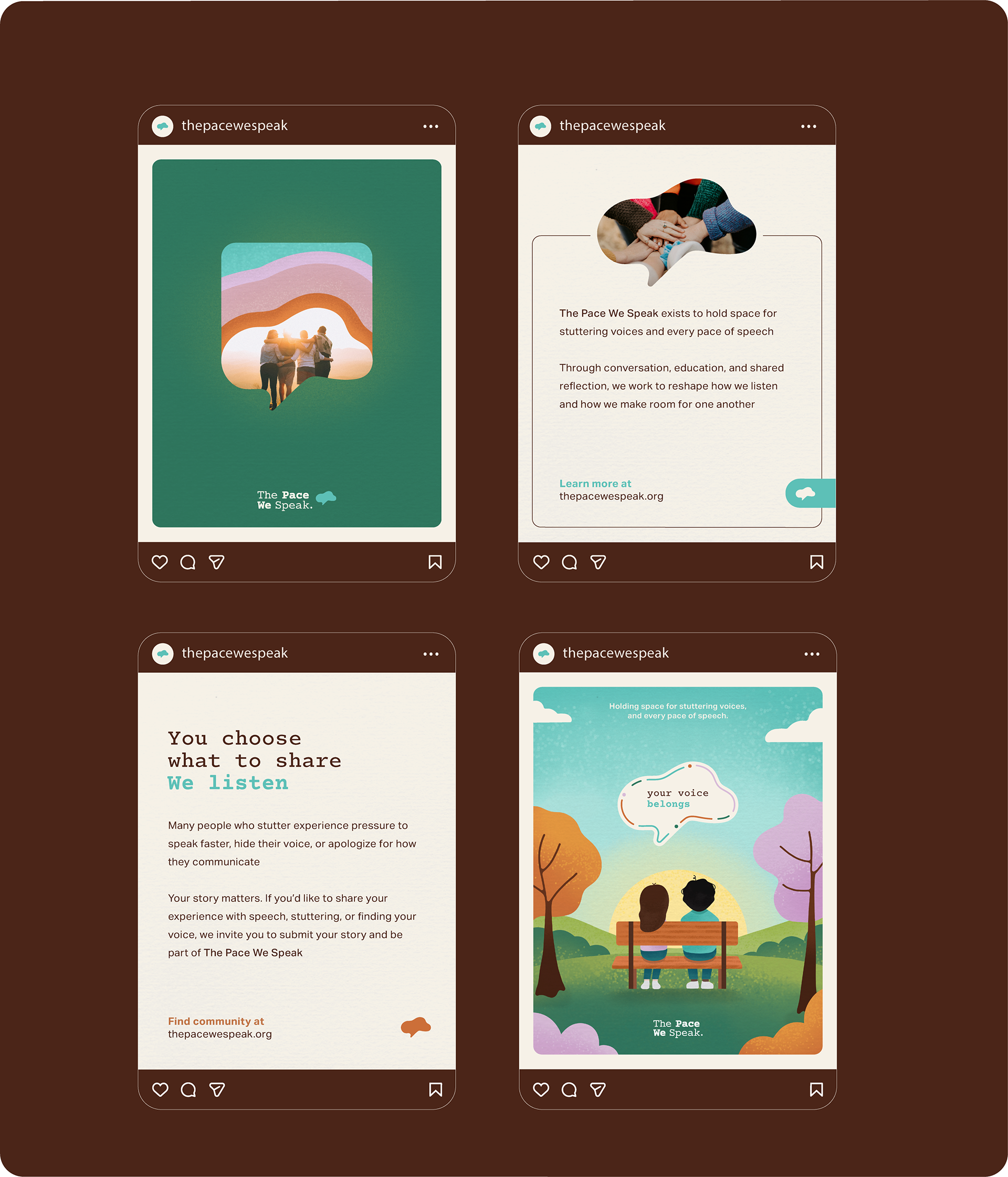
The social media presence extends the visual identity into an accessible digital space, blending illustration, photography, and intentional typography to foster reflection and conversation. Each post balances affirmation and education while maintaining gentle pacing and thoughtful composition that reflect the campaign’s core values
Motion and Expression
Logo Animation
A subtle expression of rhythm
A soft breathing animation brings the speech silhouette to life, expanding and settling in a calm rhythm. The motion mirrors the pauses and flow of speech, transforming the identity from static mark to living presence
Experiential Design
Listening Space Installation
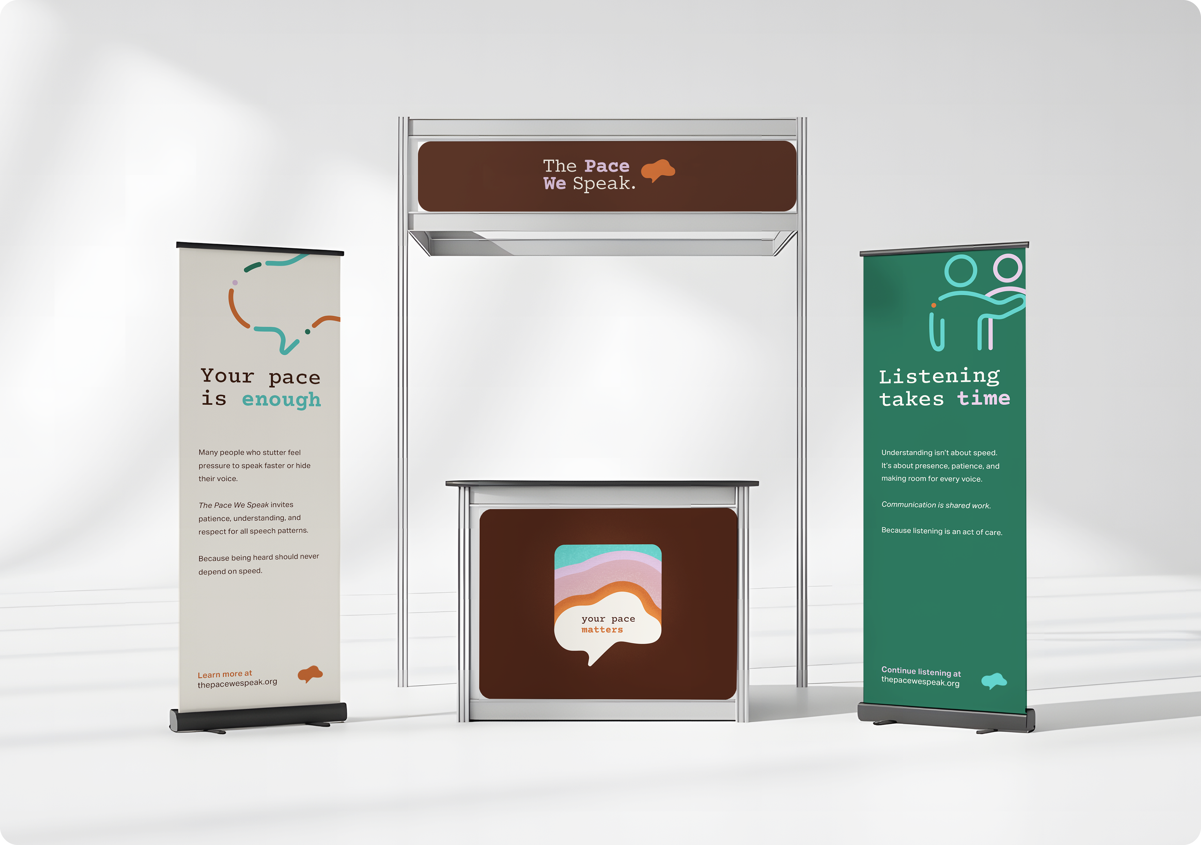
This portable installation translates the identity into a physical environment designed for public engagement. Through banners, environmental graphics, and layered messaging, the space invites visitors to pause, reflect, and reconsider the pace of communication
Color, iconography, and advocacy phrases work together to create an atmosphere rooted in presence, dignity, and care. The installation transforms the brand from visual system to lived experience
Community Resources
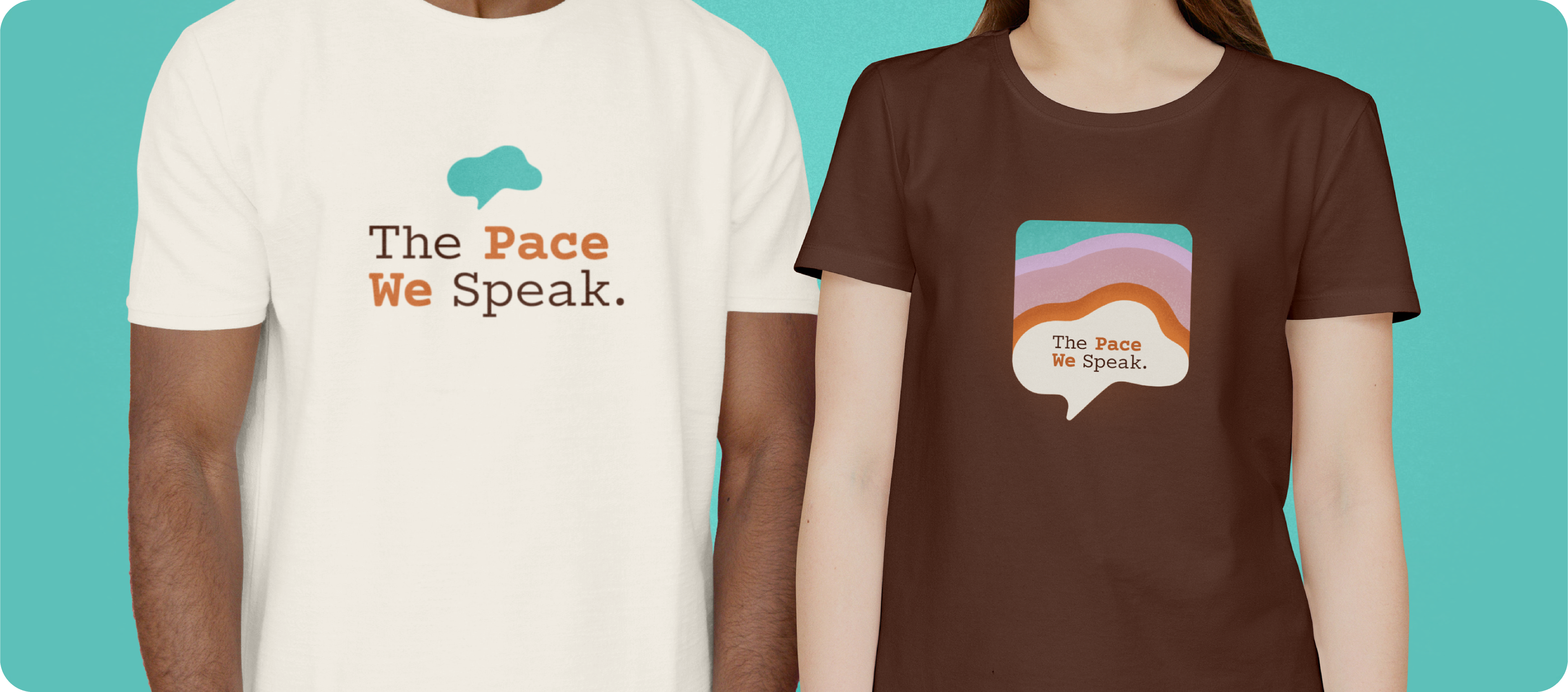
Free Advocacy Materials
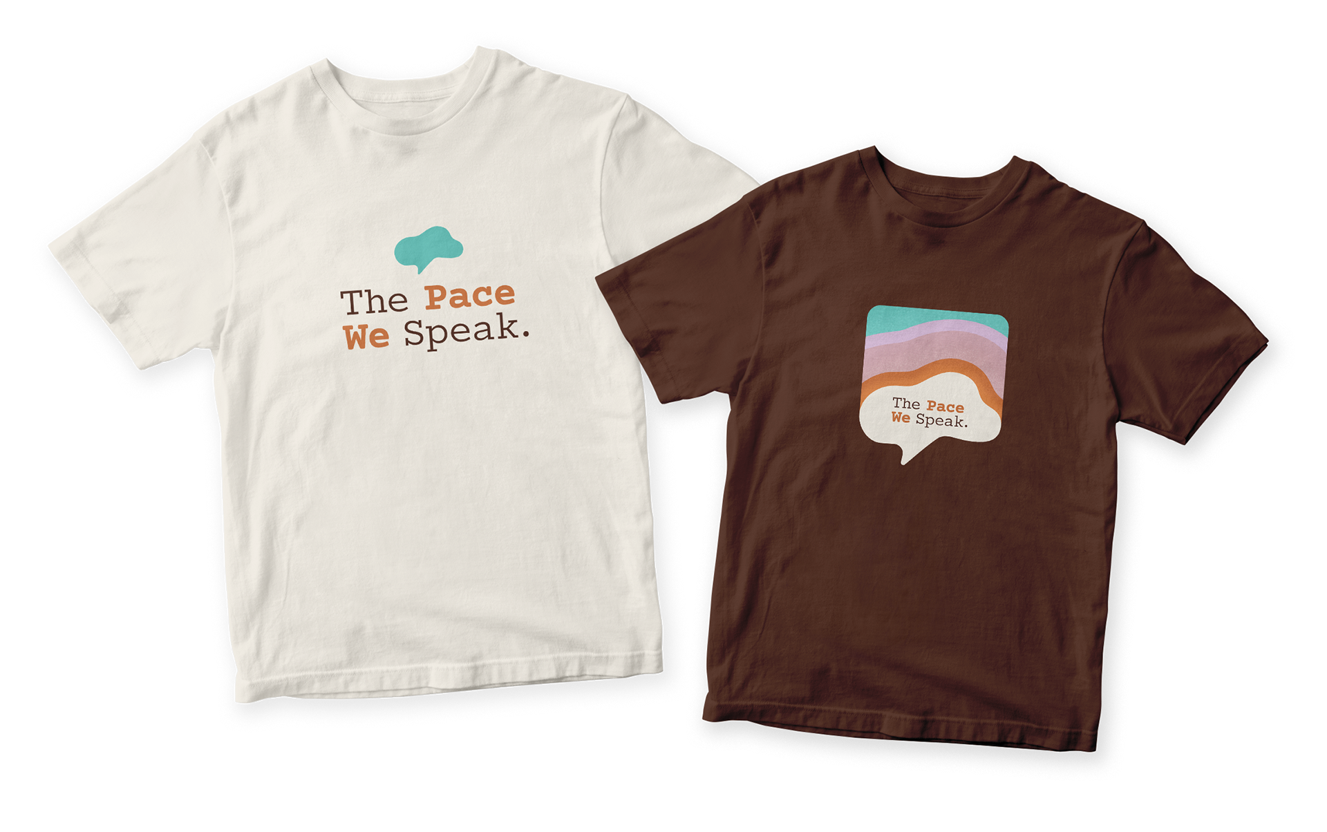
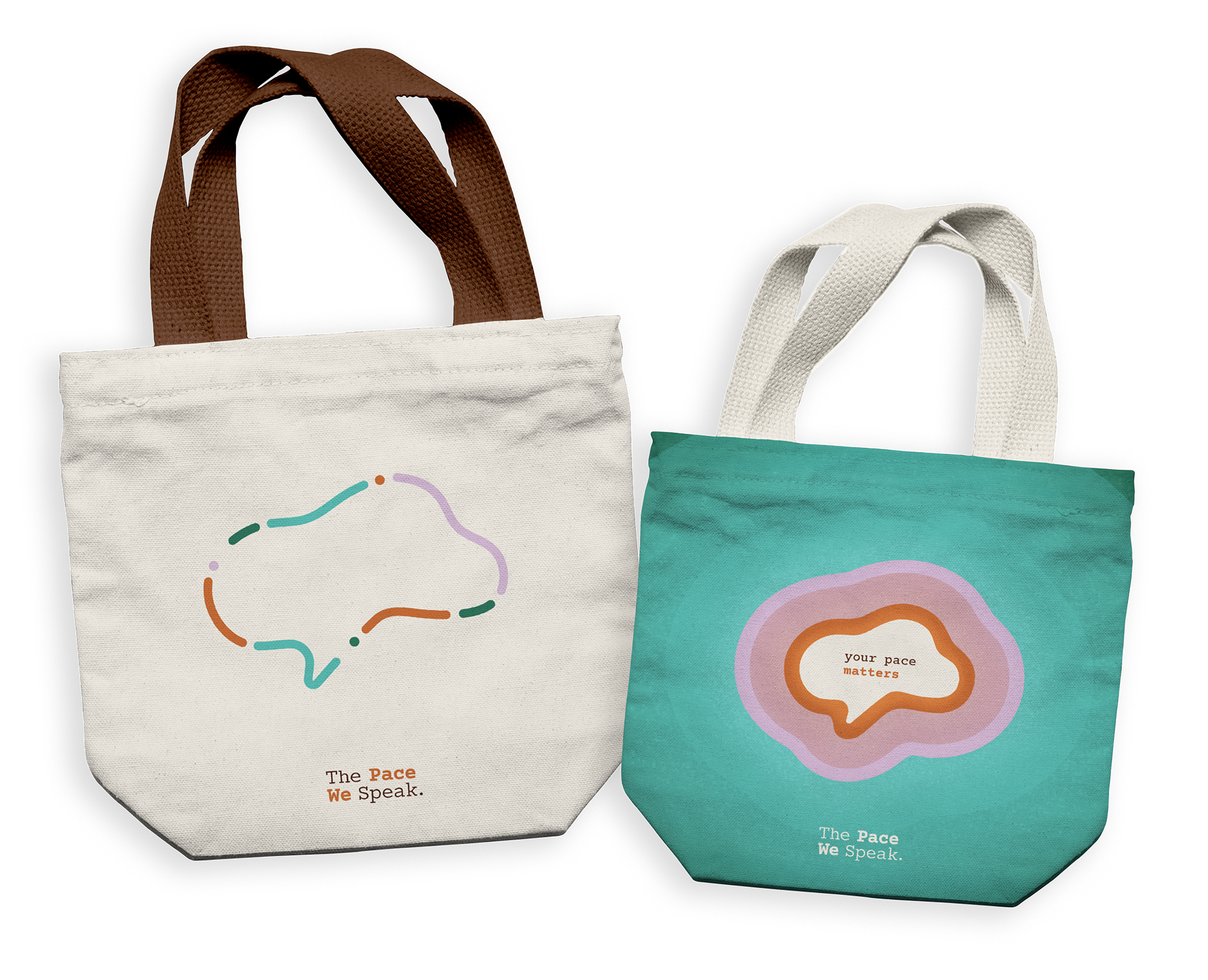
The Pace We Speak extends into a collection of free advocacy materials designed for distribution at schools, workshops, and community events. The apparel system includes a subtle logotype t-shirt for educators and supporters and a more graphic speech-bubble version for youth, while tote bags offer both a quiet symbolic design and a colorful variation featuring the affirmation your pace matters
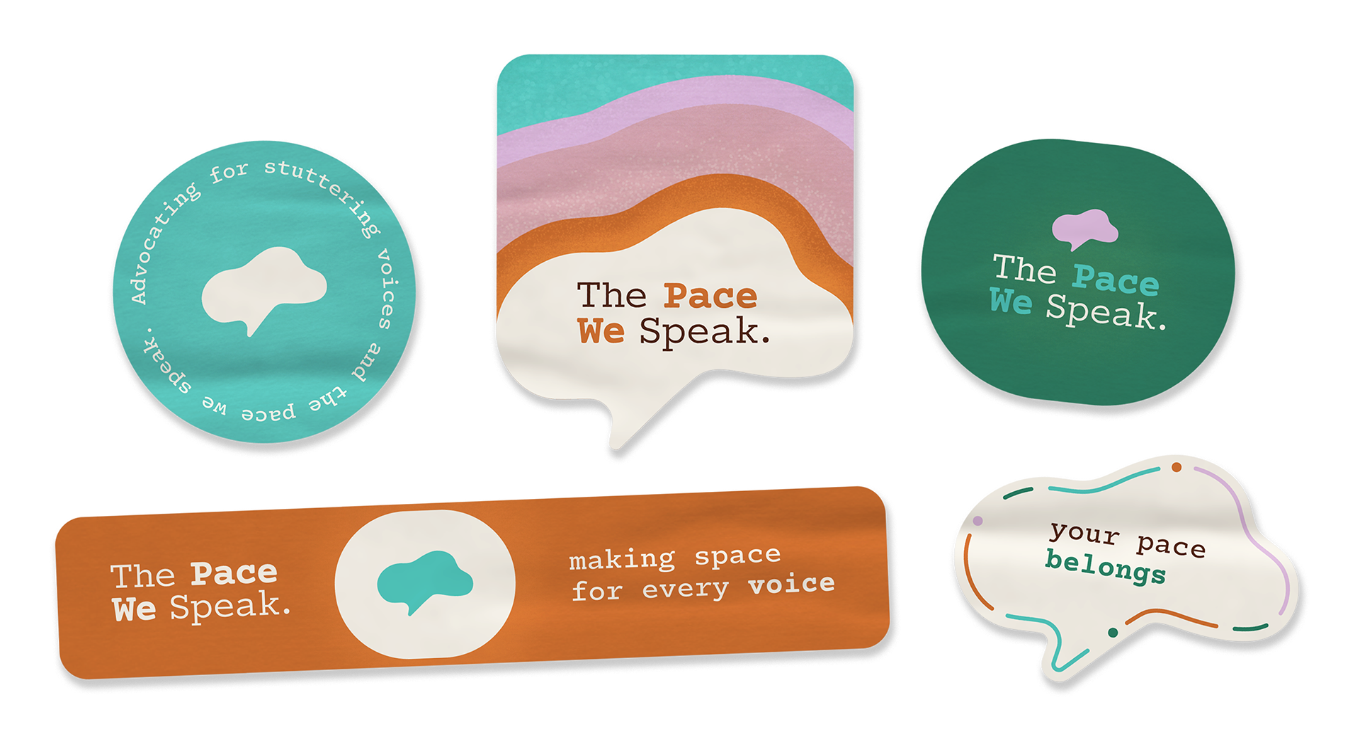
A coordinated sticker collection allows the campaign’s messages to travel organically through notebooks, laptops, and everyday spaces. Together, these materials function not as merchandise, but as tools for visibility, conversation, and connection
Web Experience
A Digital Space Designed to Breathe
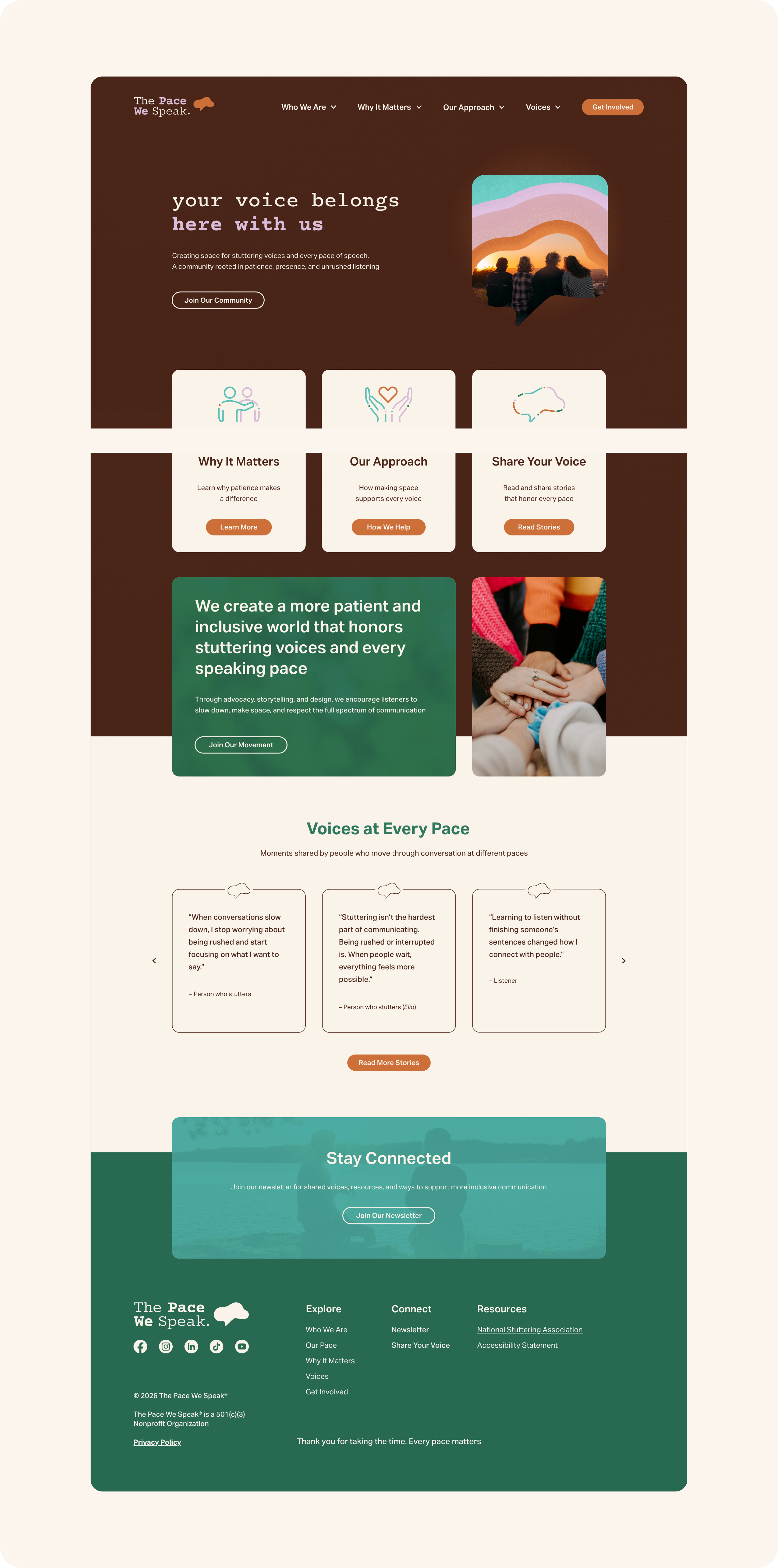
The landing page translates the visual foundation into an immersive experience designed to breathe. The color system, typography, and generous spacing work together to create steadiness and warmth, while a structured grid ensures clarity and flow. Each section builds intentionally, moving from belonging to understanding to shared stories, guiding visitors through a quiet but purposeful journey toward more patient conversation
The Pace We Speak was designed as an advocacy-driven identity rooted in dignity, patience, and shared humanity. It invites us to listen fully, honor every voice, and create space for every pace of speech
This case study is part of my evolving creative framework and will continue to expand with deeper context and insights