Work
About
Resources
Connect
Work
About
Resources
Connect
Kooky Cones
a playful ice cream brand identity inspired by
whimsy
,
colorful personalities
,
and
joyful delight
brand identity + packaging
continue wandering ✷
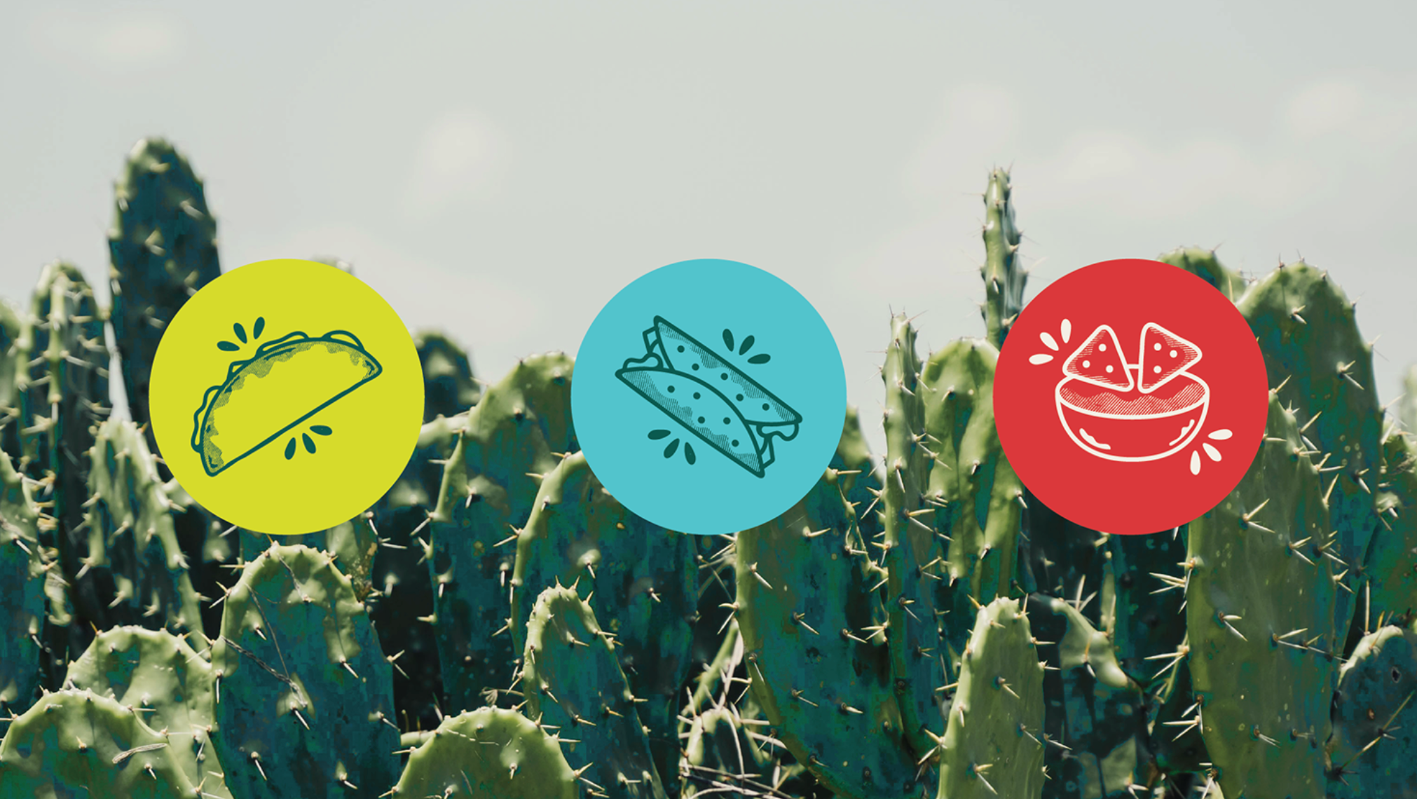
Tacos Azteca
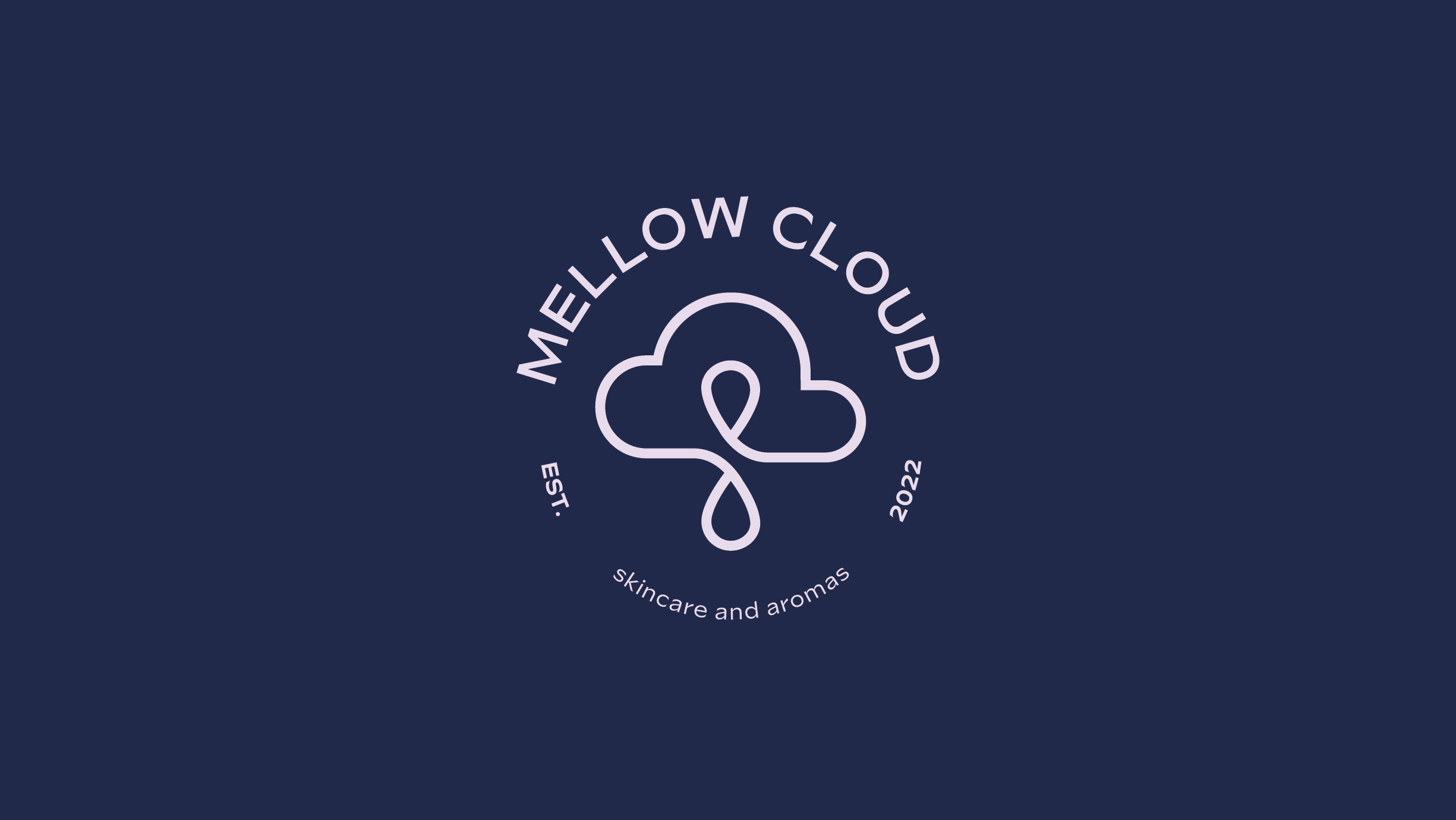
Mellow Cloud
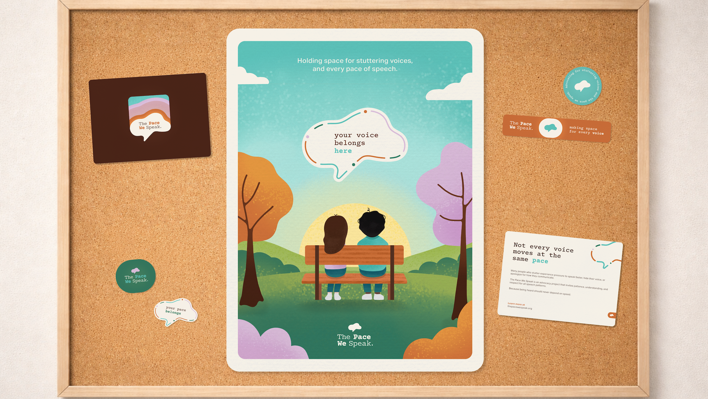
The Pace We Speak
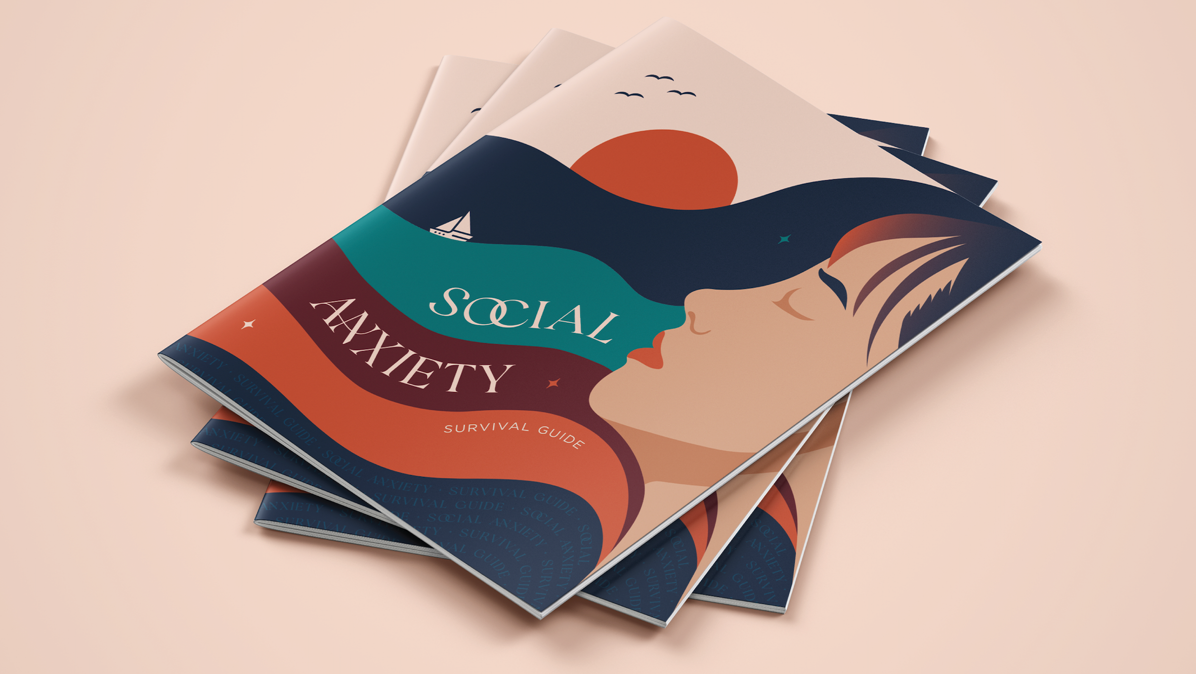
A Gentle Social Anxiety Guide
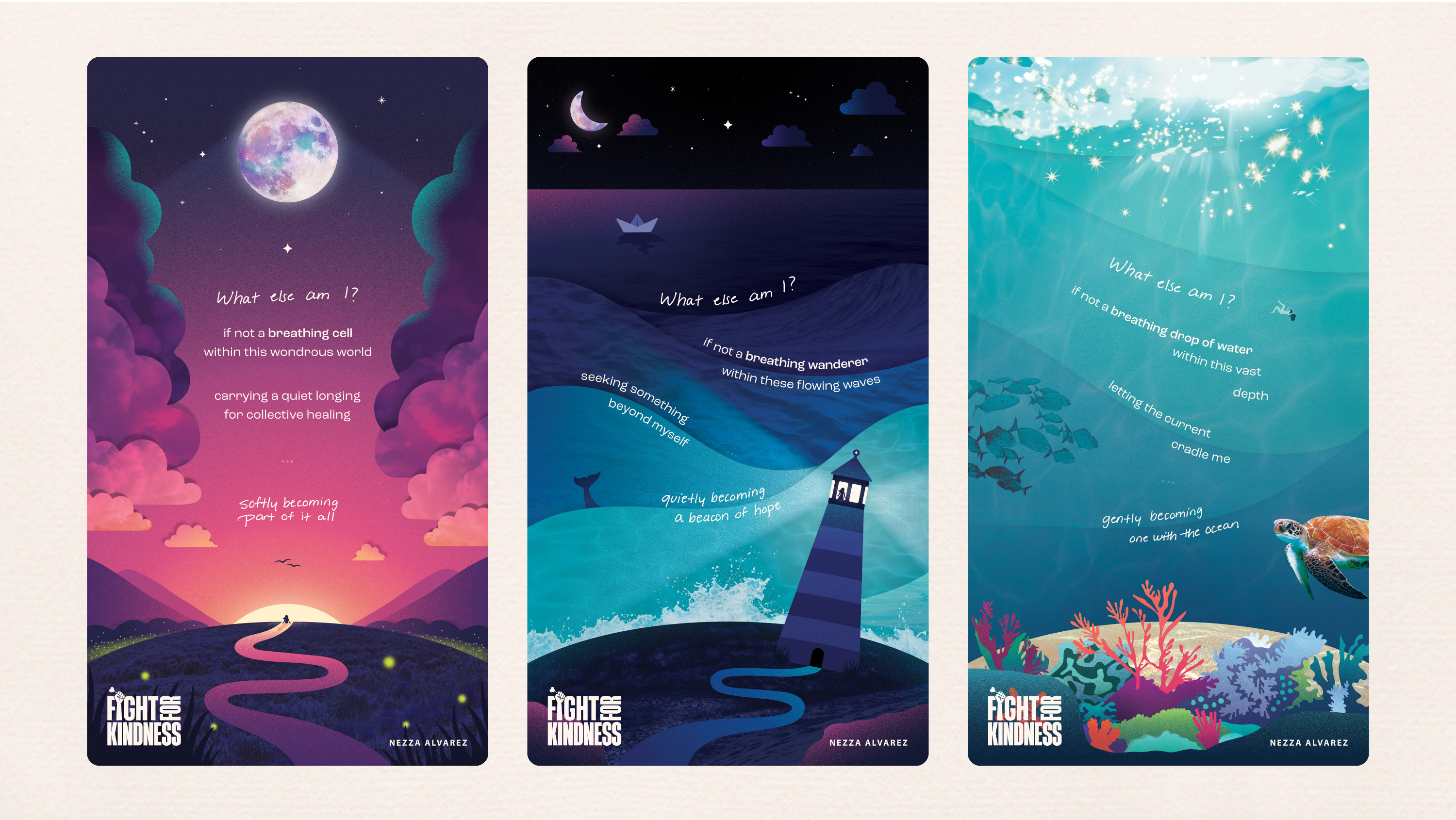
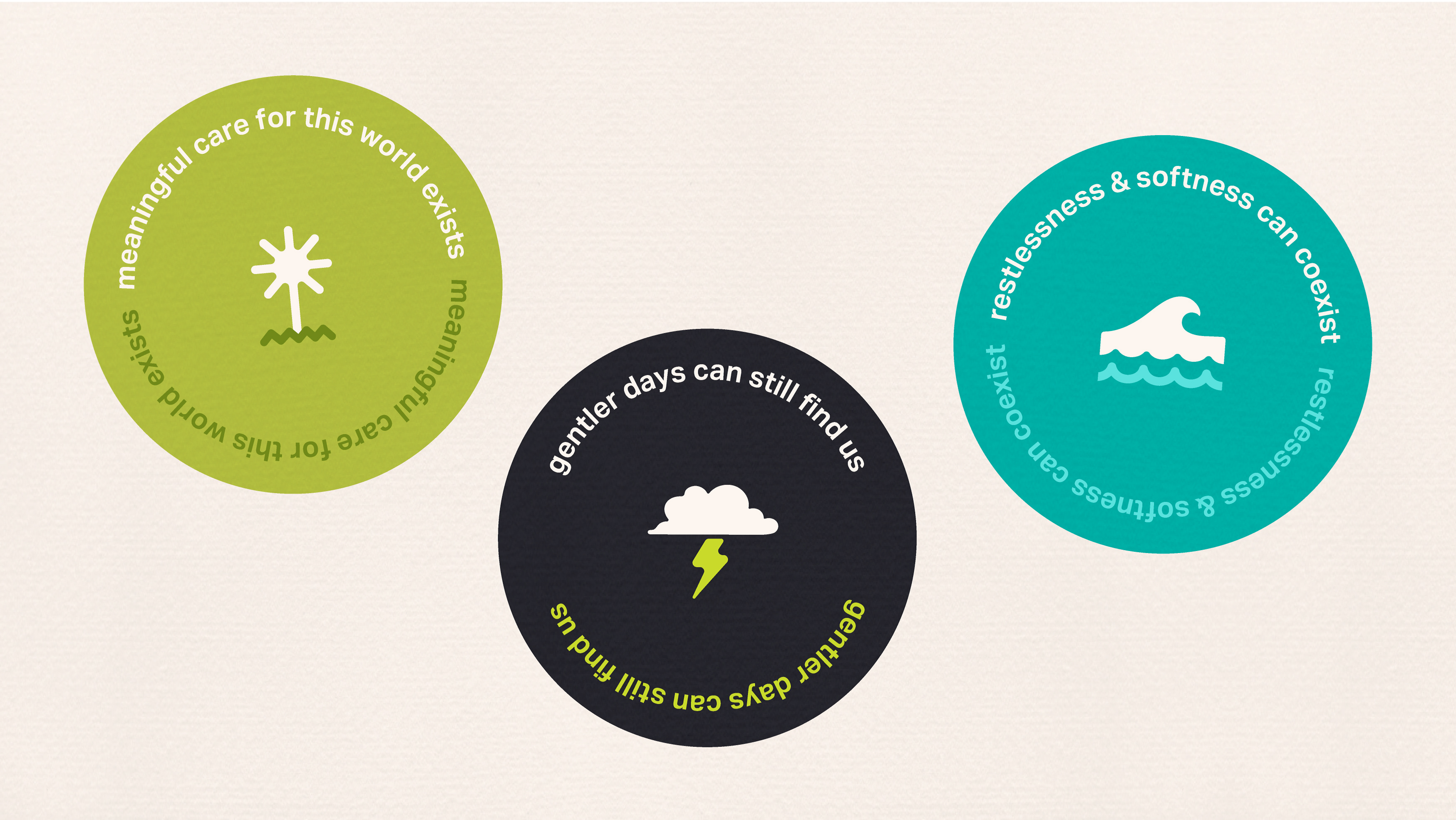
What else am I?
Quiet Anchors
VideoFest
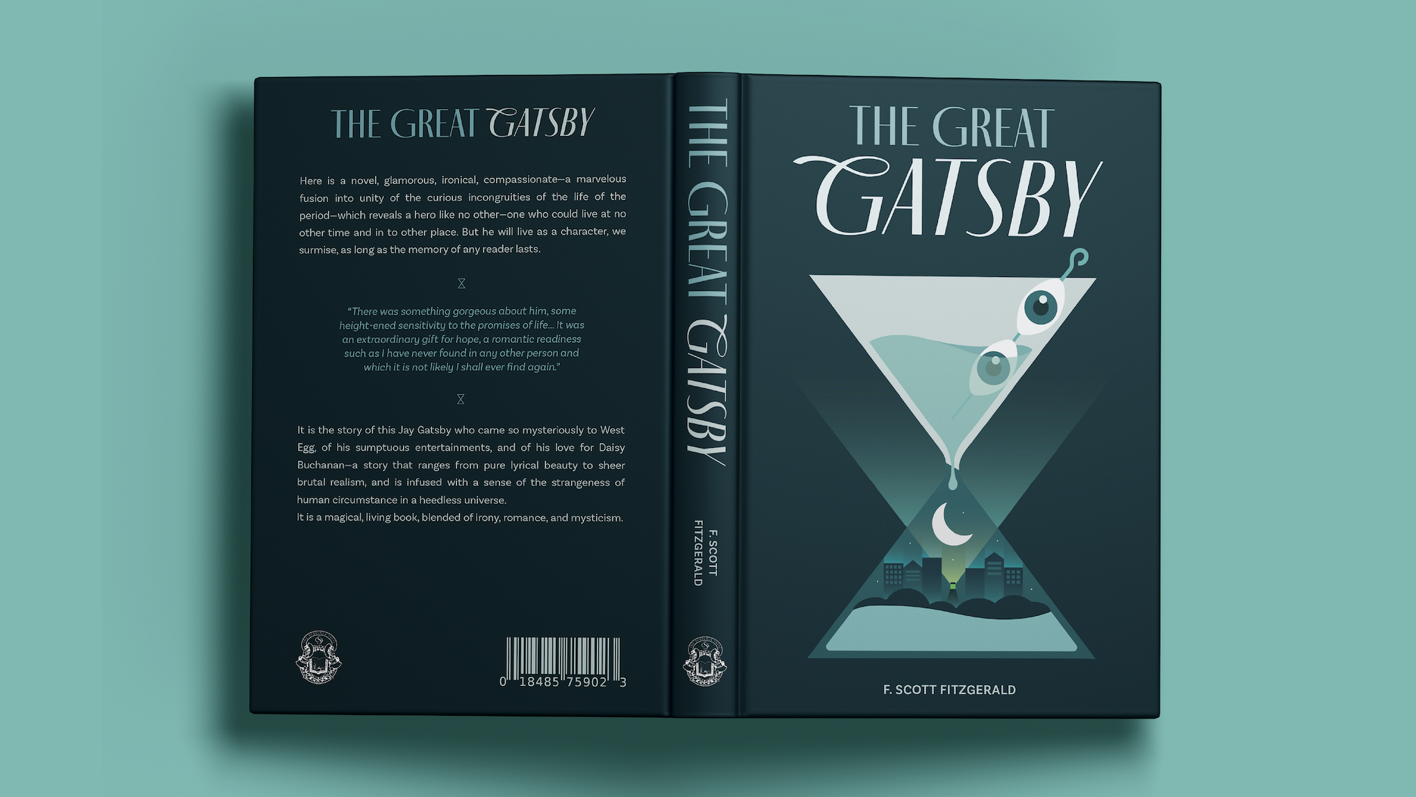
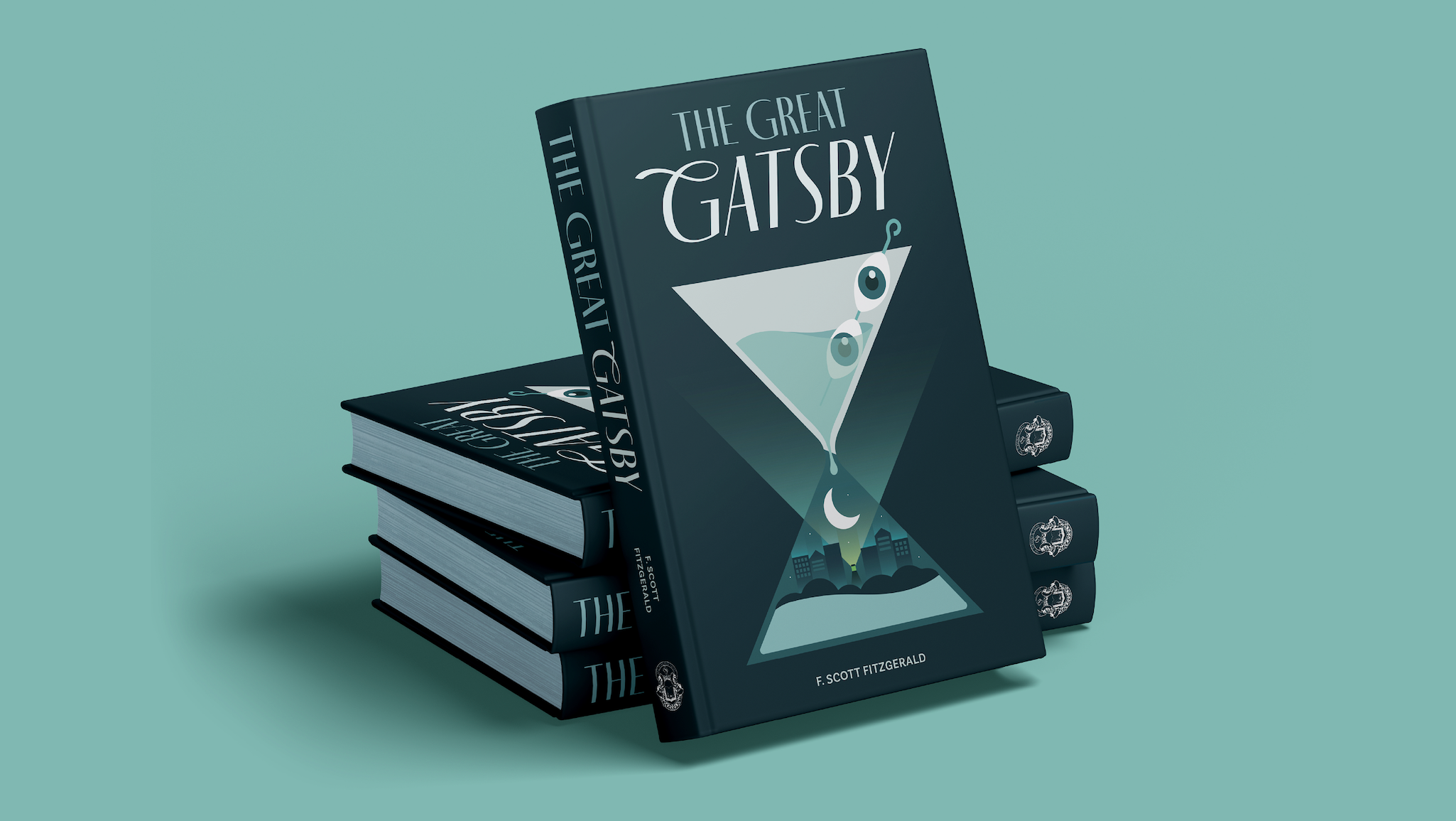
The Great Gatsby
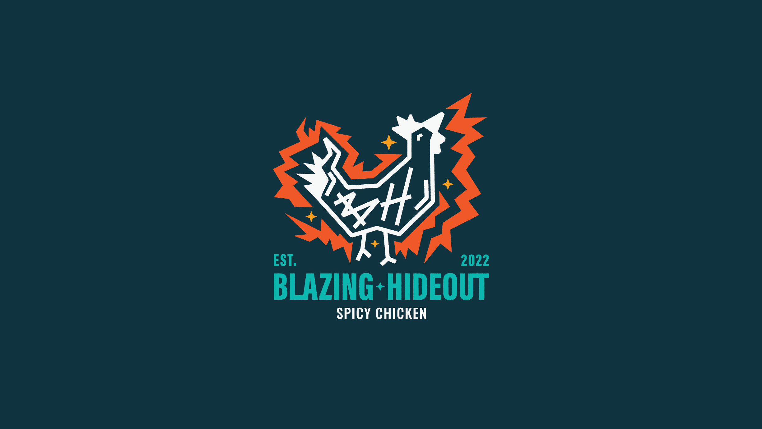
Blazing Hideout
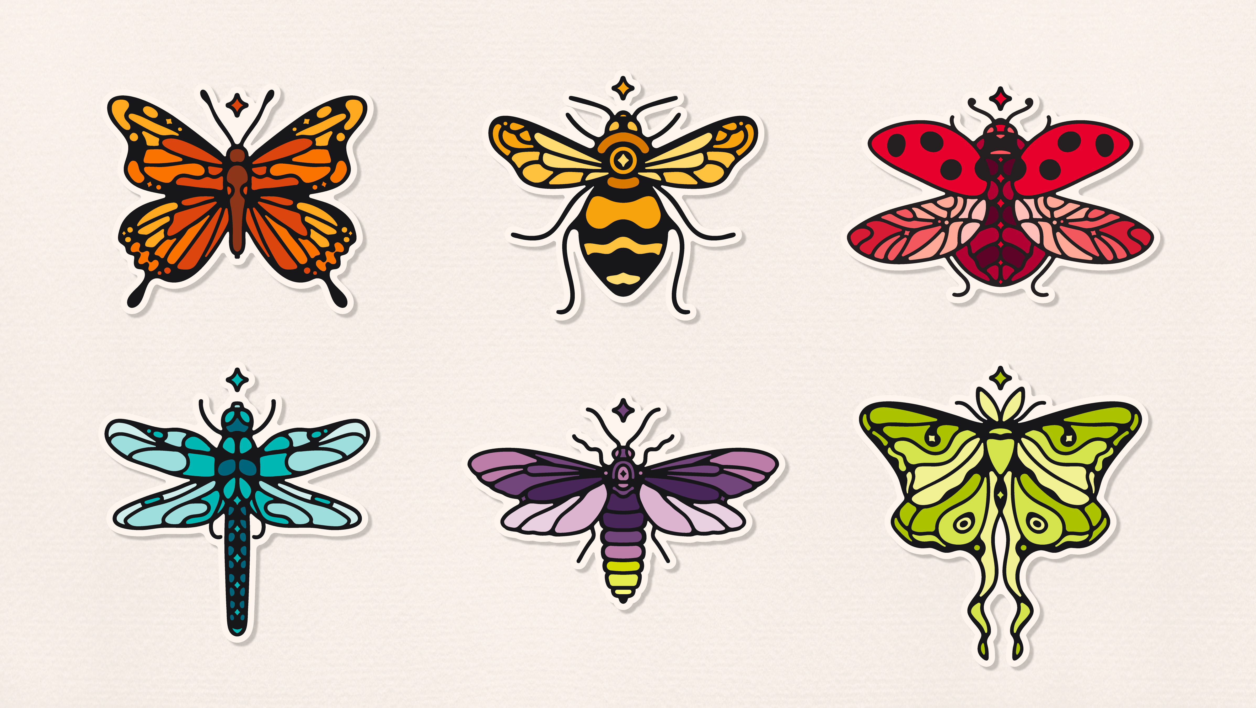
Insect Spirits
↑
Back to Top